
Multiple Choice
Respondent को चुनने के लिए options की list present करें। Single-select, multi-select, "Other" free-text, randomization, और alphabetical ordering support करता है। प्रत्येक choice अपनी खुद की image, video या icon रख सकती है, और layout property vertical list और image-card grid के बीच switch करती है — इसलिए यह एक ही type plain text options और picture-based options दोनों को cover करता है।
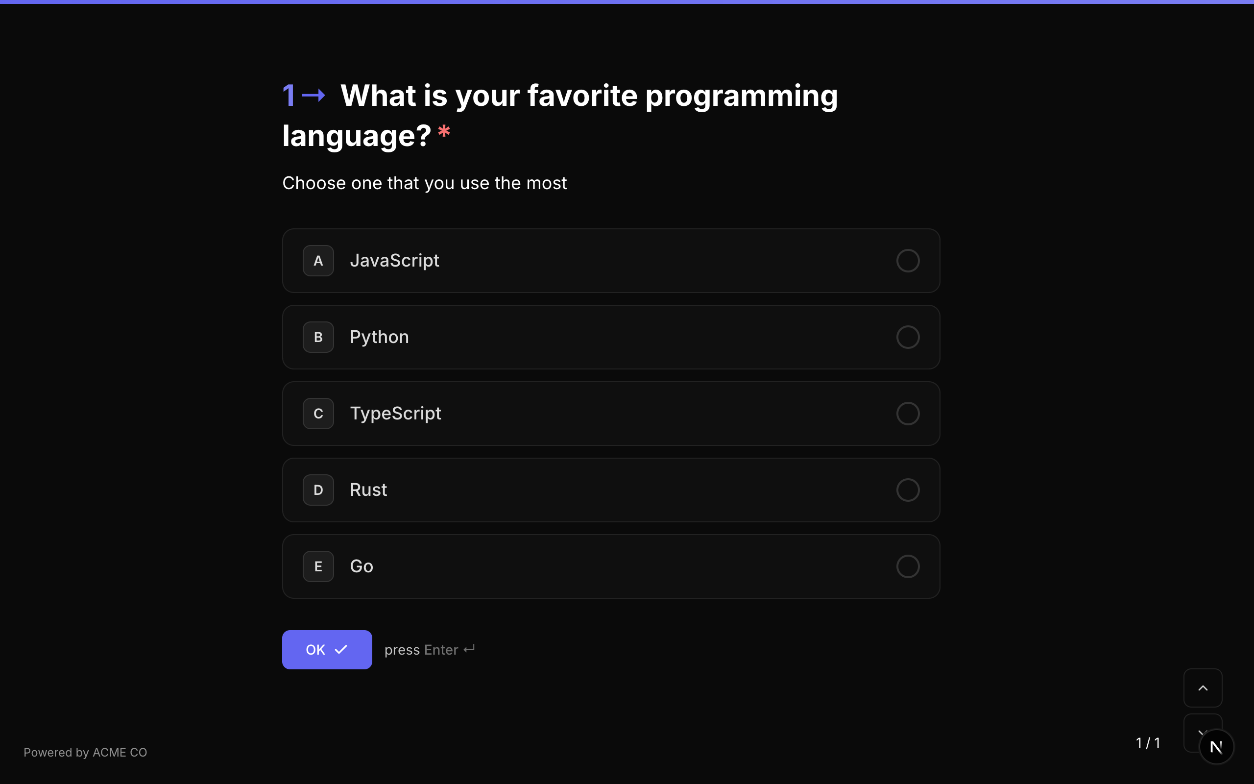
Type identifier: multiple_choice
Properties
| Property | Type | विवरण | Default |
|---|---|---|---|
choices | Choice[] | Choice options का array। प्रत्येक choice में id, label, और optional media है। | [] |
layout | string | Choices किस तरह present होती हैं: stacked (vertical list, optional thumbnails), blocks (image-card grid), staggered (content के size की chips जो wrap होती हैं), या grid (fixed-column grid)। | stacked |
allowMultiple | boolean | Respondent को एक से अधिक option select करने की अनुमति दें। | false |
allowOther | boolean | Free-text input के साथ "Other" option दिखाएं जहां respondent custom answer type कर सकता है। | false |
randomize | boolean | हर बार question display होने पर choices का order randomize करें। | false |
alphabeticalOrder | boolean | Choices को alphabetically sort करें। यदि randomize enabled है तो ignore होता है (randomize precedence लेता है)। | false |
choiceSource | string | Choices कहाँ से आती हैं: fixed choices का उपयोग करता है; variable उन्हें एक variable से load करता है। Variable से Choices देखें। | fixed |
Choice Object
choices array में प्रत्येक choice में:
| Field | Type | विवरण |
|---|---|---|
id | string | इस choice के लिए unique identifier। Logic jumps और scoring में उपयोग होता है। |
label | string | Choice के लिए display text। |
media | QuestionMedia | इस choice के लिए optional image, video या icon। यह कैसे render होती है इसे control करने के लिए media.display set करें — नीचे देखें। |
Choice Media
कोई भी choice अपनी खुद की media रख सकती है। media.display तय करता है कि वह choice पर कैसे बैठती है:
| Display | विवरण |
|---|---|
thumbnail | Choice label के बगल में एक छोटी image। |
background | Image choice surface को भर देती है, fill करने के लिए crop होकर। |
background-fit | Image choice surface को भरती है लेकिन पूरी बनी रहती है, choice के background colour के सामने letterbox होकर। |
Choice media वही treatments support करती है जो question media करती है — filters, tint, borders, focal point और zoom। Fill और Fit में क्या अंतर है और किसे कब चुनें, इसके लिए Choice Media Display देखें।
Choice media वही है जो पहले का Picture Choice question type बन गया। एक image-card grid बनाने के लिए, Multiple Choice को layout: "blocks" के साथ उपयोग करें और प्रत्येक choice को एक media object दें। Typeform से import किए गए forms picture_choice questions को अपने आप इसी shape में convert कर देते हैं।
Validation
यदि required true है, respondent को आगे बढ़ने से पहले कम से कम एक option select करना होगा।
Logic Jump Operators
equals, not_equals, is_answered, is_not_answered
equals या not_equals उपयोग करते समय, comparison value choice ID होता है। Multi-select questions के लिए, equals check करता है कि value selected items में है या नहीं।
Answer Format
- Single select (
allowMultiple: false): एक string (selected choice ID)। - Multi-select (
allowMultiple: true): एक array of strings (selected choice IDs)।
Quiz Mode Scoring
Multiple Choice सभी quiz modes में एक scorable question type है:
- Knowledge Quiz:
correctAnswers(correct choice IDs का array) औरcorrectAnswerScore(प्रति correct answer points) set करें। - Lead Qualification:
choiceScores(choice ID से point value की mapping) set करें। - Match Quiz:
choiceOutcomes(choice ID से end screen question IDs की mapping) set करें।
Choice selection के लिए keyboard shortcuts उपलब्ध हैं। Respondents options select करने के लिए letter keys (A, B, C, आदि) press कर सकते हैं, जो प्रत्येक choice के बगल में indicators के रूप में दिखाई देते हैं।
Dropdown
Options की list से select करने के लिए dropdown menu। Multiple Choice के समान configuration support करता है लेकिन options compact dropdown format में display करता है। Per-choice media और layout यहां लागू नहीं होते — dropdown हमेशा अपने options plain text के रूप में render करता है।
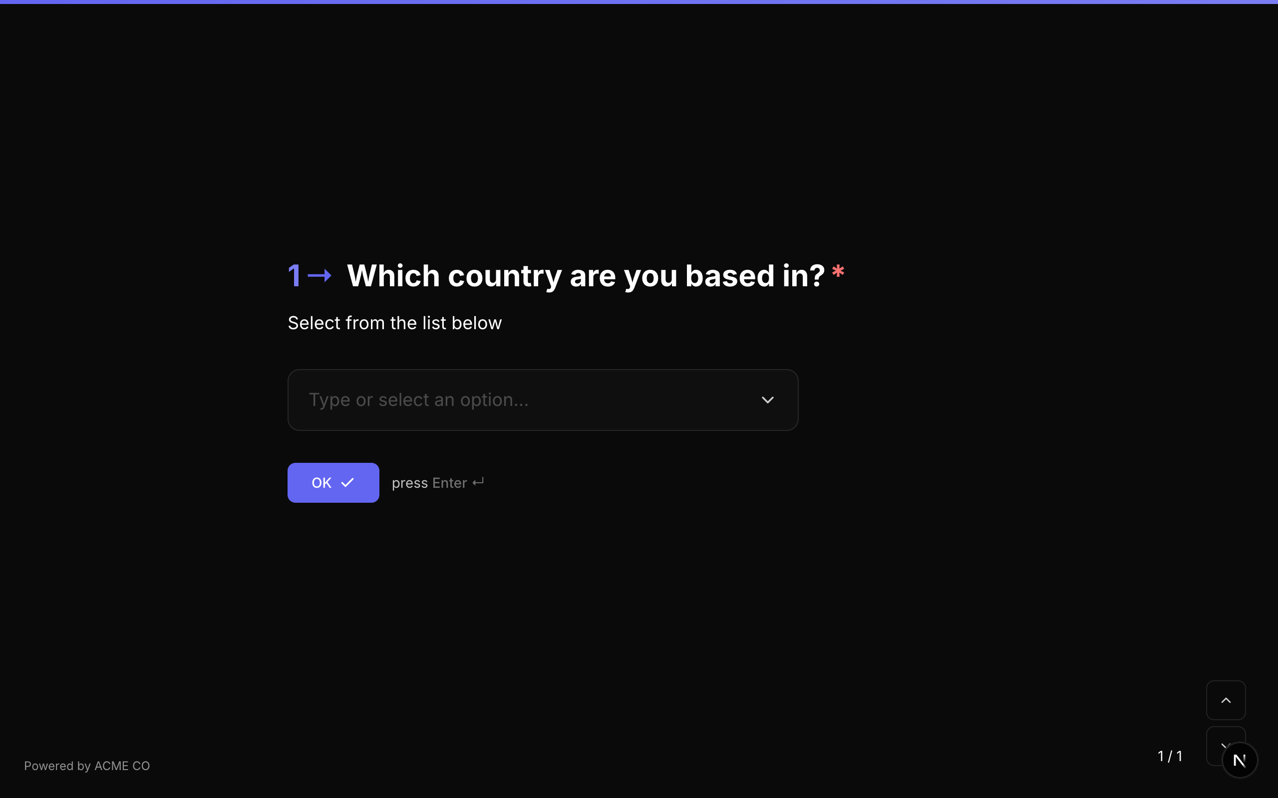
Type identifier: dropdown
Properties
| Property | Type | विवरण | Default |
|---|---|---|---|
choices | Choice[] | Choice options का array। | [] |
allowMultiple | boolean | Dropdown से multiple options select करने की अनुमति दें। | false |
allowOther | boolean | Free-text input के साथ "Other" option दिखाएं। | false |
placeholder | string | Selection से पहले दिखाया जाने वाला placeholder text। | None |
randomize | boolean | Choices का order randomize करें। | false |
alphabeticalOrder | boolean | Choices को alphabetically sort करें। | false |
choiceSource | string | Choices कहाँ से आती हैं: fixed choices का उपयोग करता है; variable उन्हें एक variable से load करता है। Variable से Choices देखें। | fixed |
Validation
यदि required true है, respondent को कम से कम एक option select करना होगा।
Logic Jump Operators
equals, not_equals, is_answered, is_not_answered
Answer Format
- Single select: एक string (selected choice ID)।
- Multi-select: एक array of strings (selected choice IDs)।
Quiz Mode Scoring
Dropdown एक scorable question type है। Scoring configuration Multiple Choice के identical है।
Picture Choice
Picture Choice अब कोई अलग question type नहीं रहा। इसे Multiple Choice में merge कर दिया गया है — select करने के लिए अब कोई picture_choice identifier नहीं है।
वही चीज़ बनाने के लिए, एक Multiple Choice question उपयोग करें जिसमें layout को blocks पर set किया गया हो और प्रत्येक choice पर एक media object हो। Picture Choice जो कुछ करता था वह सब अब भी उपलब्ध है, साथ ही वे treatments भी जो उसमें कभी नहीं थे: video और icon choices, filters, tint, focal point, zoom, और एक Fit mode जो चौड़ी images को crop करने के बजाय पूरी दिखाता है।
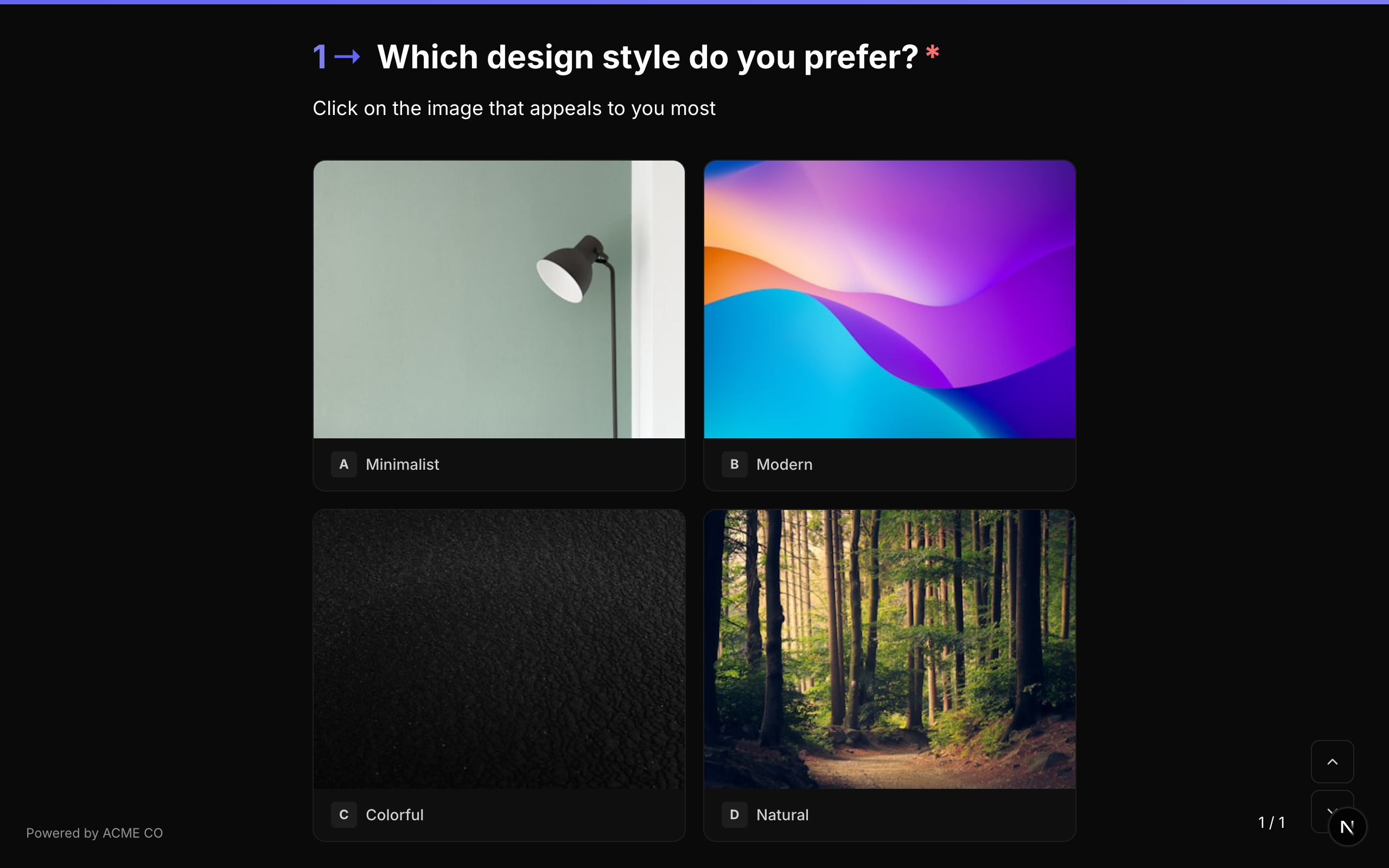
{
  "type": "multiple_choice",
  "properties": {
    "layout": "blocks",
    "choices": [
      { "id": "c1", "label": "Mountains", "media": { "type": "image", "url": "https://…", "display": "background" } },
      { "id": "c2", "label": "Coast", "media": { "type": "image", "url": "https://…", "display": "background" } }
    ]
  }
}
मौजूदा forms और Typeform imports आपके लिए संभाल लिए जाते हैं — एक picture_choice question अपने आप layout: "blocks" वाले Multiple Choice में convert हो जाता है, इसलिए कुछ भी दोबारा author करने की ज़रूरत नहीं।
Yes / No
एक simple binary question जो "Yes" और "No" buttons present करता है।
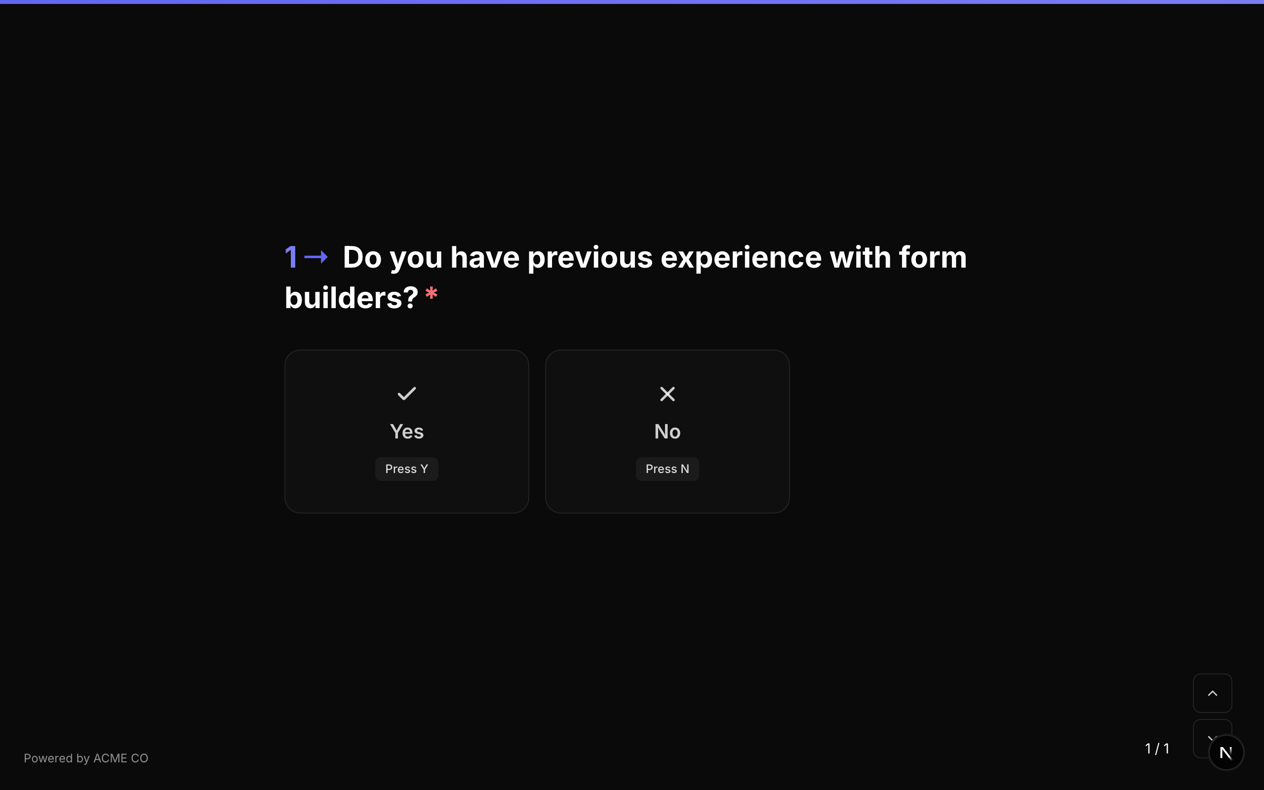
Type identifier: yes_no
Properties
Yes/No question type में common question properties के अलावा कोई अतिरिक्त properties नहीं हैं।
Validation
यदि required true है, respondent को "Yes" या "No" में से एक click करना होगा।
Logic Jump Operators
equals, not_equals, is_answered, is_not_answered
equals उपयोग करते समय, true (Yes) या false (No) से compare करें। String values "true" और "false" भी accept होते हैं।
Answer Format
Answer एक boolean (true Yes के लिए, false No के लिए, या unanswered होने पर null) के रूप में store होता है।
Quiz Mode Scoring
Yes/No एक scorable question type है:
- Knowledge Quiz:
correctAnswersको"true"या"false"की single value के साथ set करें। - Lead Qualification:
choiceScoresको"true"और"false"keys के साथ set करें। - Match Quiz:
choiceOutcomesको"true"और"false"keys के साथ set करें।
Yes/No question selection करने पर तुरंत अगले question पर auto-advance करता है। कोई अलग "OK" button नहीं है।
Ranking
Respondent को drag and drop करके preferred order में arrange करने के लिए items की list present करें।
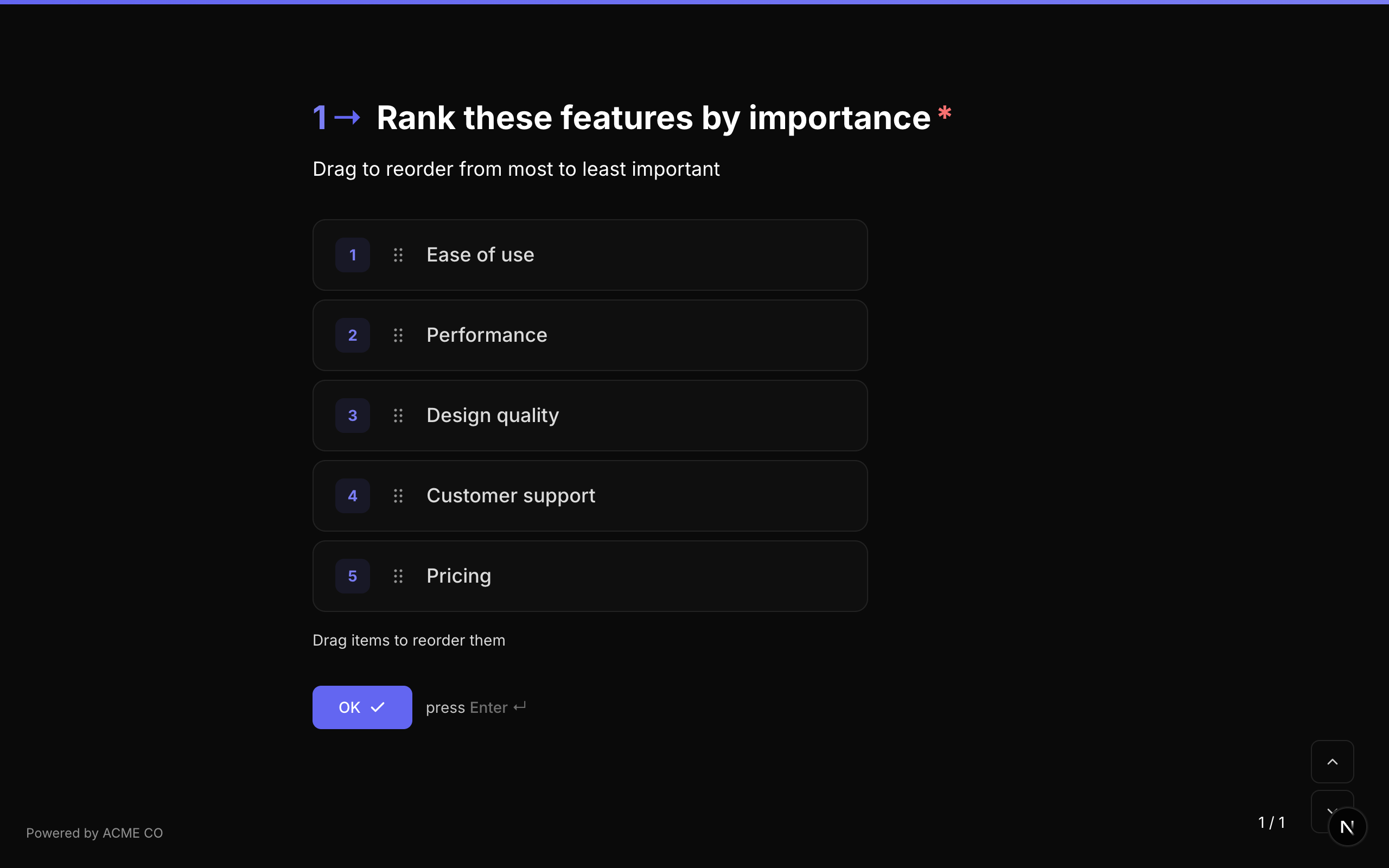
Type identifier: ranking
Properties
| Property | Type | विवरण | Default |
|---|---|---|---|
choices | Choice[] | Rank करने के लिए items का array। प्रत्येक में id और label है। | [] |
choiceSource | string | Items कहाँ से आते हैं: fixed choices का उपयोग करता है; variable उन्हें एक variable से load करता है। Variable से Choices देखें। | fixed |
Validation
यदि required true है, respondent को ranking submit करनी होगी (सभी items defined order में होने चाहिए)।
Logic Jump Operators
equals, not_equals, is_answered, is_not_answered
Answer Format
Answer एक array of strings (respondent के ranked order में choice IDs, first से last तक) के रूप में store होता है।
["choice_3", "choice_1", "choice_2"]
Ranking field drag-and-drop interaction उपयोग करता है। Mobile devices पर, respondents items reorder करने के लिए touch gestures उपयोग कर सकते हैं।
Matrix
एक grid-based question type जहां respondents multiple items (rows) को multiple categories (columns) में rate करते हैं। प्रत्येक row-column intersection एक selectable option है।
Type identifier: matrix
Properties
| Property | Type | विवरण | Default |
|---|---|---|---|
rows | string[] | Row labels का array (rate किए जा रहे items)। | [] |
columns | string[] | Column labels का array (rating categories)। | [] |
randomizeRows | boolean | Rows का order randomize करें। | false |
randomizeColumns | boolean | Columns का order randomize करें। | false |
rowSource | string | Rows कहाँ से आती हैं: fixed rows का उपयोग करता है; variable उन्हें एक variable से load करता है। Variable से Choices देखें। | fixed |
columnSource | string | Columns कहाँ से आते हैं: fixed columns का उपयोग करता है; variable उन्हें एक variable से load करता है। | fixed |
Validation
यदि required true है, respondent को प्रति row एक option select करना होगा।
Logic Jump Operators
equals, not_equals, is_answered, is_not_answered
Answer Format
Answer एक object (Record<string, string>) के रूप में store होता है जो प्रत्येक row label को selected column label से map करता है:
{
  "Product Quality": "Excellent",
  "Customer Service": "Good",
  "Value for Money": "Average"
}
Matrix questions desktop पर responsive grid के रूप में display होते हैं और बेहतर usability के लिए mobile devices पर stacked format में adapt होते हैं। Rows और columns दोनों independent randomization support करते हैं।
List
एक ही प्रकार की multiple entries collect करें। एक List या तो plain टेक्स्ट आइटम (type करें और Enter दबाएं, या जोड़ें tap करें) या repeating कंपोज़िट आइटम रखती है — किसी पुन: उपयोग योग्य कंपोज़िट से बनी structured entries, जैसे एक ही प्रश्न में कितने भी board members add करना।
Type identifier: list
Properties
| Property | Type | विवरण | Default |
|---|---|---|---|
itemType | string | plain text items के लिए string, repeatable composite instances के लिए composite। | string |
compositeId | string | reference किया गया कंपोज़िट (केवल composite items)। picker के माध्यम से set होता है। | — |
itemPlaceholder | string | entry input के लिए placeholder text (text items)। | — |
addButtonLabel | string | दोनों item modes में Add button के लिए custom label। | — |
minItems | number | submit करने के लिए आवश्यक items की minimum संख्या। | — |
maxItems | number | items की maximum संख्या। Hard cap 100। | 100 |
itemRegex | string | Per-item validation pattern (text items)। | — |
itemRegexError | string | pattern fail होने पर दिखाया जाने वाला error message। | — |
itemMinLength | number | प्रति item minimum अक्षर (text items)। | — |
itemMaxLength | number | प्रति item maximum अक्षर (text items)। | — |
allowDuplicates | boolean | वही text item दो बार add करने की अनुमति दें (text items)। | true |
allowReorder | boolean | Respondents को reorder करने के लिए items drag करने दें (text items)। | true |
defaultItems | string[] | प्रश्न पहली बार load होने पर pre-filled items (text items, web forms)। | [] |
displayMode | string | एक collapsed composite entry कैसे render होती है: compact (एक-पंक्ति summary) या card (हर field label + value)। | compact |
compactFields | string[] | compact collapsed summary में दिखाए जाने वाले ordered sub-field IDs। डिफ़ॉल्ट रूप से कंपोज़िट का पहला field। | — |
Validation
यदि required true है, कम से कम एक item add होना चाहिए। minItems / maxItems submit पर लागू होते हैं; per-item pattern और length rules (text items) हर item add होते समय लागू होते हैं।
Logic Jump Operators
list_count_equals, list_count_greater_than, list_count_less_than, contains, not_contains, is_answered, is_not_answered
Count operators answer में items की संख्या से compare करते हैं।
Answer Format
- Text items: एक array of strings।
- Composite items: एक array of objects, प्रत्येक sub-field ID द्वारा keyed:
[
  { "sub_first_name": "Ada", "sub_email": "ada@example.com" },
  { "sub_first_name": "Grace", "sub_email": "grace@example.com" }
]
प्रत्येक composite item एक standalone कंपोज़िट प्रविष्टि के रूप में भी record किया जाता है — cross-form प्रविष्टियाँ view और collapsed display modes के लिए कंपोज़िट guide देखें।
Variable से Choices
Multiple Choice, Dropdown और Ranking अपने options को fixed list की जगह एक variable से load कर सकते हैं — आमतौर पर एक Data Node का response, जो आपकी API को call करता है। Matrix भी अपनी rows, columns या दोनों के लिए ऐसा कर सकता है।
Setup करना
- एक Data Node जोड़ें जो list return करे, और उसका रिस्पॉन्स वेरिएबल set करें — जैसे
breeds। - Question की settings में विकल्पों का स्रोत को निश्चित सूची (default) से बदलकर किसी वेरिएबल से पर set करें। Matrix में पंक्तियों का स्रोत और कॉलम का स्रोत का उपयोग करें।
- वह variable डालें जिसमें list है:
{breeds}, या response के अंदर का path, जैसे{breeds.data}। - अगर आपके items
labelऔरvaluekeys का उपयोग नहीं करते, तो क्या आपके आइटम अलग फ़ील्ड नाम इस्तेमाल करते हैं? खोलें और अपने data में इस्तेमाल होने वाले लेबल फ़ील्ड और वैल्यू फ़ील्ड डालें।
NueForm style वाले form में Data Node को question से पहले रखें। Questionnaire style वाले form में Data Node का कब चलाएँ अपडेट रखें पर set करें, ताकि list respondent के answers के साथ update होती रहे — प्रश्नावली शैली देखें।
ये source settings केवल उन questions पर मिलती हैं जो सीधे form में रखे गए हैं। प्रश्न समूह, बहु-प्रश्न पृष्ठ या किसी कंपोज़िट के अंदर के question के लिए builder इन्हें नहीं दिखाता, क्योंकि ऐसे questions अपना answer अपने parent के answer के अंदर save करते हैं, जहाँ labels नहीं रखे जा सकते। जो question पहले से किसी variable से options load करता है, उसे इनमें से किसी में move करने पर भी उसकी setting बनी रहती है, लेकिन तब उसके responses में labels की जगह items की values दिखती हैं।
Builder canvas पर question अपने options की जगह {breeds} से विकल्प दिखाता है।
Accepted Formats
Variable में एक JSON list होनी चाहिए — या तो plain strings की, जहाँ हर string label भी है और value भी:
["Siamese", "Persian"]
या label और value वाले objects की:
[
  { "label": "Siamese", "value": "siamese" },
  { "label": "Persian", "value": "persian" }
]
दूसरी keys वाले objects भी काम करते हैं — उन keys को लेबल फ़ील्ड और वैल्यू फ़ील्ड में डालें। इस response के लिए variable {breeds.data}, लेबल फ़ील्ड name और वैल्यू फ़ील्ड id का उपयोग करें:
{ "data": [{ "name": "Siamese", "id": "siamese" }, { "name": "Persian", "id": "persian" }] }
Multiple Choice में किसी item में एक image URL भी हो सकता है, जो उस option की picture बन जाता है:
[{ "label": "Siamese", "value": "siamese", "image": "https://example.com/siamese.jpg" }]
अगर response एक object है, तो {breeds.data} जैसे dot path से उसके अंदर की list तक पहुँचें। जो key plain word नहीं है, उसके लिए {breeds["the list"]} का उपयोग करें।
Items कैसे पढ़े जाते हैं
- हर item की value उसका choice ID बन जाती है। Answer यही store करता है, logic conditions यही compare करती हैं और quiz scoring यही match करती है।
- अगर किसी object में केवल label या केवल value है, तो वही दोनों के लिए उपयोग होता है। Numbers और
true/falsetext के रूप में पढ़े जाते हैं। - बिना value वाले items, पहले वाले item जैसी ही value वाले items, और 500 characters से लंबी values skip हो जाती हैं। 500 characters से लंबे labels छोटे कर दिए जाते हैं, और केवल पहले 1,000 items उपयोग होते हैं।
- Labels plain text के रूप में दिखते हैं: कोई formatting लागू नहीं होती, और उनमें मौजूद
{variable}tokens replace नहीं होते। - "अन्य" option Multiple Choice और Dropdown में अब भी काम करता है: यह load हुए items के बाद दिखता है।
- Question की बाकी settings — जैसे एकाधिक चयन की अनुमति दें, क्रम रैंडमाइज़ करें और वर्णमाला क्रम — load हुए items पर हमेशा की तरह लागू होती हैं।
- एक Data Node अपने response के अधिकतम 4,096 characters रखता है, इसलिए लंबी list कटी हुई पहुँच सकती है। Choice Lists के लिए Data Node Responses देखें।
Respondents को क्या दिखता है
Fixed list पर कोई fallback नहीं है। जब तक variable में एक usable list नहीं होती, question options की जगह नीचे दिए गए पहले तीन messages में से एक दिखाता है। आख़िरी message list बदलने के बाद options के ऊपर दिखता है:
| Message | कब |
|---|---|
| विकल्प लोड हो रहे हैं… | List भरने वाला Data Node चल रहा है। |
| ऊपर दिए गए प्रश्नों के उत्तर देने के बाद विकल्प दिखाई देंगे। | Variable अभी खाली है — आमतौर पर इसलिए कि Data Node किसी answer का इंतज़ार कर रहा है। |
| ये विकल्प लोड नहीं किए जा सके। | Variable में usable list नहीं है। Builder preview इसकी वजह भी बताता है। |
| आपके पिछले उत्तर के आधार पर अपडेट किया गया। | List बदल गई और respondent का चुना हुआ कोई option अब उपलब्ध नहीं है, इसलिए उसे clear कर दिया गया। |
Saved Answers
- Answer item values store करता है, बिल्कुल choice IDs की तरह। Matrix में answer हर row की value को चुने गए column की value से map करता है।
- Respondent ने जो labels देखे, वे answer के साथ save होते हैं, इसलिए responses, CSV exports और notification emails values की जगह labels दिखाते हैं।
- Webhooks values के साथ एक
valueLabelsmap भी भेजते हैं, जो हर चुनी गई value को उसके label से जोड़ता है — web और phone call, दोनों तरह के submissions में। - List तब load होती है जब respondent form भर रहा होता है, इसलिए NueForm submit की गई values को उस list से दोबारा check नहीं करता। Required questions अब भी enforce होते हैं। अगर किसी answer का आपके अपने items में से एक होना ज़रूरी है, तो response process करते समय अपने system में इसे verify करें।
Scoring और Conditions
- Scoring: tick करने के लिए कोई fixed list नहीं है, इसलिए scoring editor item values माँगता है, जो बिल्कुल match होनी चाहिए ("आइटम के वैल्यू से बिल्कुल मेल खाता है।")। Form Modes देखें।
- Conditions: इन questions पर logic jumps और visibility conditions text operators और एक typed value का उपयोग करती हैं। Matrix पर condition editor केवल
is_answeredऔरis_not_answeredदेता है, क्योंकि उसका answer rows को columns से जोड़ता है। Logic Jumps देखें। - Phone calls: agent list के सभी options पढ़ता है, और caller कोई option बोल सकता है या उसका number दबा सकता है। टेलीफ़ोनी में "वेरिएबल से विकल्प" section देखें।
Source Properties
| Property | Type | विवरण | Default |
|---|---|---|---|
choiceSource | string | fixed choices का उपयोग करता है। variable options को choiceVariable से load करता है, और choices ignore हो जाता है। | fixed |
choiceVariable | string | List वाला variable, जैसे {breeds} या {breeds.data}। | — |
choiceLabelField | string | Object items के लिए: हर item का label रखने वाली key। | label |
choiceValueField | string | Object items के लिए: हर item की value रखने वाली key। | value |
Matrix में हर axis के लिए यही set है: rowSource, rowVariable, rowLabelField, rowValueField और columnSource, columnVariable, columnLabelField, columnValueField।