Overview
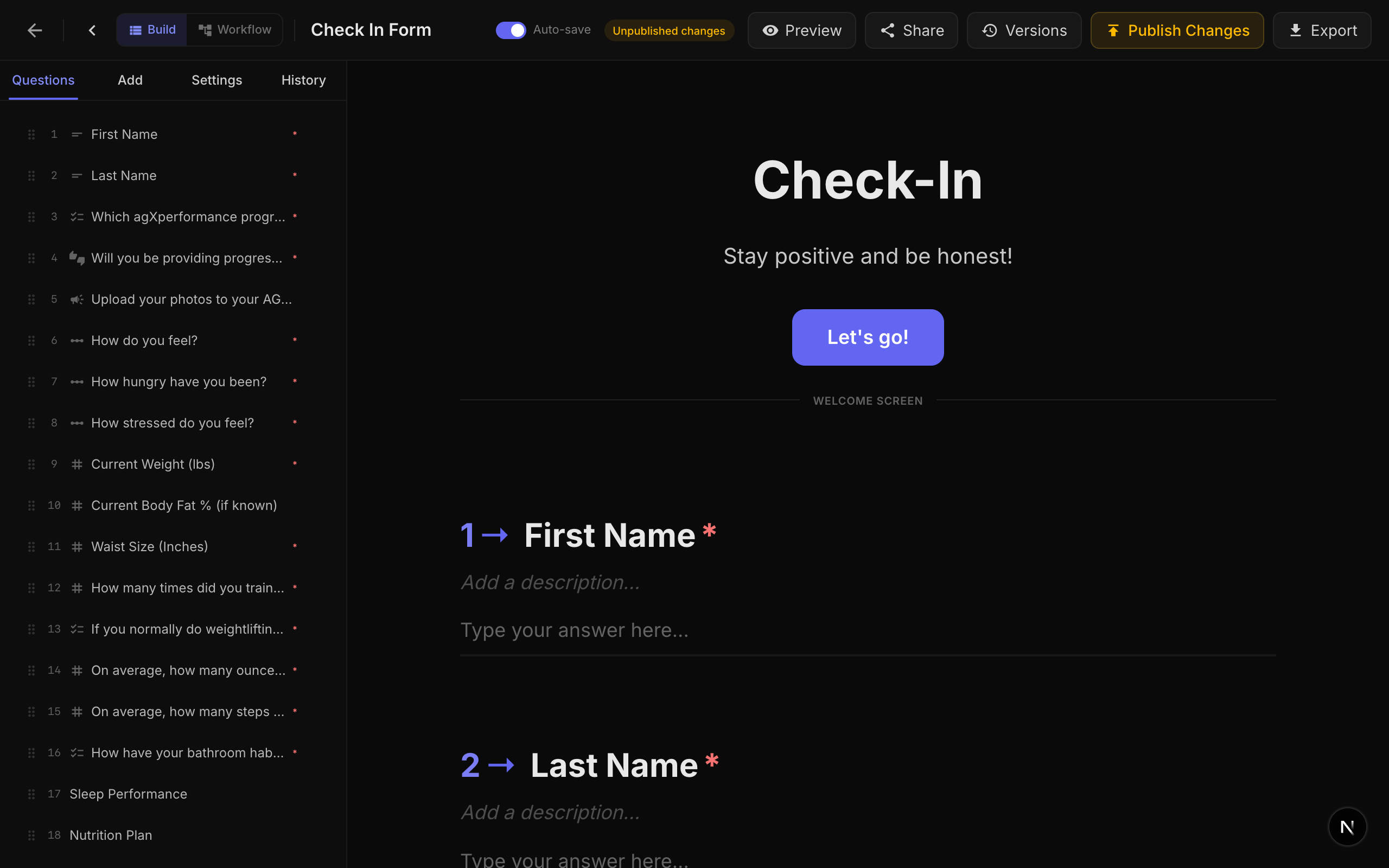
NueForm provides extensive theming capabilities that let you match your forms to your brand. Every visual aspect of a form can be customized, from colors and fonts to logos and custom CSS.
Theme Properties
Theme properties are set at the form level and apply to every question in the form. They are converted into CSS custom properties (variables) at render time, so all components automatically adapt.
Color Properties
| Property | CSS Variable | Description | Default |
|---|---|---|---|
| Background Color | --fc-bg | The background color of the entire form. | #0a0a0a |
| Text Color | --fc-text | The primary text color for questions and content. | #e8e8e8 |
| Theme Color (Accent) | --fc-accent | The accent color used for highlights, active states, and question numbers. | #6366f1 |
| Answer Text Color | --fc-answer-text | The color of text typed by the respondent in input fields. | #e8e8e8 |
| Placeholder Color | --fc-placeholder | The color of placeholder text in input fields. | rgba(255,255,255,0.25) |
| Button Color | --fc-btn-bg | The background color of primary buttons (OK, Start, Submit). Falls back to the theme color if not set. | #6366f1 |
| Button Text Color | --fc-btn-text | The text color of primary buttons. | #ffffff |
| Title Color | --fc-title-color | The color of question/activity titles. Falls back to the text color. | Inherits text color |
| Description Color | --fc-description-color | The color of question/activity descriptions. | Text color at 55% opacity |
| Option Text Color | --fc-option-color | The color of choice option labels and activity content. | Inherits text color |
| Indicator Background Color | --fc-indicator-bg | Background color of activity indicators in Fuse activities. | Accent at 15% opacity |
| Indicator Text Color | --fc-indicator-text | Text color of activity indicators. | Accent color |
Derived Color Variables
The theme system automatically generates additional CSS variables from your base colors for use in various component states:
| CSS Variable | Description |
|---|---|
--fc-accent-hover | Lightened accent color for hover states. |
--fc-accent-8 through --fc-accent-60 | Accent color at various opacity levels (8%, 10%, 15%, 20%, 30%, 40%, 60%). |
--fc-text-2 through --fc-text-85 | Text color at various opacity levels (2%, 4%, 5%, 6%, 8%, 10%, 12%, 15%, 20%, 40%, 55%, 75%, 80%, 85%). |
--fc-input-bg | Input background (text color at 5% opacity). |
--fc-card-bg | Card background (text color at 4% opacity). |
--fc-border | Border color (text color at 12% opacity). |
--fc-muted | Muted/secondary text (text color at 45% opacity). |
--fc-primary | Primary color (alias for accent). |
--fc-btn-bg-hover | Lightened button background for hover states. |
Font Properties
NueForm loads fonts from Google Fonts automatically. Any Google Font family can be used.
| Property | CSS Variable | Description | Default |
|---|---|---|---|
| Question Font | --fc-font-question | Font family for question titles. | Inter |
| Answer Font | --fc-font-answer | Font family for respondent input text. | Inter |
| Button Font | --fc-font-button | Font family for button labels. | Inter |
| Description Font | --fc-font-description | Font family for question/activity descriptions. | Inherits question font |
| Option Font | --fc-font-option | Font family for choice option labels and activity content. | Inherits answer font |
| Indicator Font | --fc-font-indicator | Font family for activity indicator text. | Inherits question font |
| Question Font Size | --fc-font-size-question | The font size for question titles. Accepts any CSS size value (rem, px, etc.). | 1.875rem (30px) |
Fonts are loaded from Google Fonts on demand. The system automatically generates the correct Google Fonts CSS import URL, requesting weights 300 through 700 for each font family. The default font Inter is pre-loaded and does not require a Google Fonts request.
Branding
Logo
You can add a logo to your forms in two positions:
Top Logo:
| Setting | Description | Default |
|---|---|---|
| Top Logo URL | URL of the logo image displayed at the top of the form. | None |
| Top Logo Size | Size of the top logo: small, medium, or large. | medium |
| Top Logo Alignment | Horizontal alignment: left, center, or right. | center |
| Top Logo CSS | Custom CSS applied to the top logo container (.fc-top-logo). | None |
Branding Logo:
| Setting | Description | Default |
|---|---|---|
| Branding Logo URL | URL of the branding logo, typically displayed in the footer or watermark area. | None |
Footer Text
| Setting | Description | Default |
|---|---|---|
| Branding Footer Text | Custom text displayed in the form footer area. | None |
Watermark CSS
| Setting | Description | Default |
|---|---|---|
| Watermark CSS | Custom CSS applied to the watermark/bottom-left logo element (.fc-watermark). | None |
Hide Branding (Pro+)
| Setting | Description | Default |
|---|---|---|
| Hide Branding | Removes the NueForm branding from the form. Requires a Pro+ plan. | Disabled |
Hiding NueForm branding is a Pro+ feature. On free and lower-tier plans, the NueForm watermark is always displayed.
Branding Defaults
Account-level branding defaults let you set default theme values that apply to all new forms you create. These can be overridden at the form level.
Available branding defaults:
- Logo URL
- Footer Text
- Theme Color
- Background Color
- Text Color
- Answer Text Color
- Placeholder Color
- Button Color
- Button Text Color
- Font Family (Question)
- Font Family (Answer)
- Font Family (Button)
- Question Font Size
- Top Logo URL, Size, Alignment, and CSS
- Watermark CSS
Question-Level Transitions
Each question can have its own transition animation, or you can apply the same transition to all questions. Available transitions:
| Transition | Description |
|---|---|
| Vertical Slide + Fade | Questions slide up/down with a fade effect. This is the default. |
| Horizontal Slide | Questions slide left/right. |
| Diagonal Slide | Questions slide diagonally. |
| Elastic Bounce | Questions bounce in with an elastic overshoot. |
| Zoom Through | Questions zoom in/out through the viewport. |
| Rotate In | Questions rotate slightly as they enter. |
You can set the transition for individual questions in the question editor, or use the "Apply to all questions" option to set a uniform transition.
Custom CSS
For complete control over your form's appearance, you can write custom CSS. See the Custom CSS guide for the full list of available selectors and CSS variables.
Per-Question Styling
Individual questions support these styling options:
| Property | Description |
|---|---|
| Custom Class Name | Add a CSS class to the question container. Use this in combination with Custom CSS to style specific questions differently. |
| Hide Question Number | Remove the question number prefix from this specific question. |
| Media Custom Class Name | Add a CSS class to the media element attached to this question. |
Theme for Light vs. Dark Backgrounds
NueForm's default theme uses a dark background (#0a0a0a) with light text (#e8e8e8). The derived CSS variables (borders, inputs, cards) are all computed relative to the text color, so switching to a light theme is straightforward:
- Set Background Color to a light color (e.g.,
#ffffff). - Set Text Color to a dark color (e.g.,
#1a1a1a). - The derived variables (
--fc-border,--fc-input-bg,--fc-card-bg,--fc-muted) will automatically adapt because they are based on the text color's opacity variations.
When switching between light and dark themes, make sure to also adjust the Placeholder Color, Answer Text Color, and Button Color to maintain readability and contrast.