Overview
NueForm lets you build beautiful, interactive forms that present one question at a time. This guide covers everything from creating your first form to configuring advanced settings like quiz modes and incremental submission.
Creating a New Form
To create a new form:
- Navigate to My Forms from the dashboard.
- Click the New Form button.
- Choose between a NueForm (standard form) or a Fuse (real-time collaborative activity).
- Give your form a title and optional description.
- Start adding questions from the question type palette.
Every form is automatically assigned a unique slug for its public URL. You can customize this slug at any time from the form settings.
Form Settings
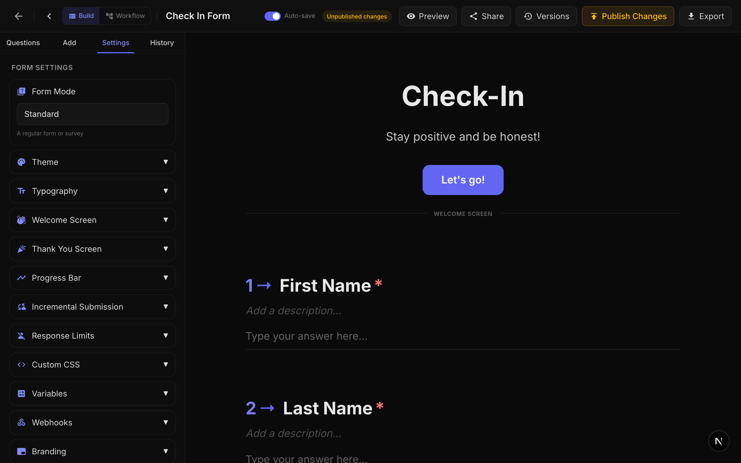
Basic Settings
| Setting | Description | Default |
|---|---|---|
| Title | The form's title, displayed in the dashboard and optionally on the welcome screen. | Required |
| Description | An optional description for internal reference. | Empty |
| Slug | The URL path for your published form (e.g., nueform.io/f/my-survey). Must be unique. | Auto-generated |
| Show Progress Bar | Displays a progress bar showing how far the respondent has progressed. | Enabled |
| Limit One Response | Restricts each visitor to a single submission using browser-based visitor identification. | Disabled |
| Incremental Submission | Saves partial responses as the respondent progresses, so data is captured even if they abandon the form. | Disabled |
| Allow Resume | Les répondants peuvent reprendre un formulaire partiellement rempli. Les réponses sont enregistrées dans la base de données après chaque question, leur permettant de reprendre là où ils se sont arrêtés — sur n'importe quel appareil lorsqu'ils sont connectés, ou sur le même navigateur lorsqu'ils sont anonymes. | Activé |
Allow Resume
Lorsque Allow Resume est activé (par défaut), NueForm enregistre de manière transparente la progression de chaque répondant dans la base de données au fur et à mesure qu'ils avancent dans le formulaire. Le répondant n'a rien à valider pour que l'enregistrement ait lieu — cela se produit automatiquement.
Ce que voient les répondants
- Modale de reprise au chargement du formulaire. Lorsqu'un répondant revient et qu'une progression partielle est détectée, une modale bloquante apparaît demandant « Continuer là où vous vous êtes arrêté ? » avec deux choix :
- Continuer — restaure leurs réponses précédentes et les positionne sur la prochaine question sans réponse.
- Recommencer — supprime la progression enregistrée (après une étape de confirmation) et démarre une nouvelle tentative.
- Modale d'enregistrement de la progression au chargement (multi-appareils). Si un utilisateur NueForm connecté ouvre un formulaire ouvert (un formulaire qui n'exige pas de connexion), il voit une modale proposant « Enregistrez votre progression sur votre profil pour reprendre sur n'importe quel appareil. » Choisir Enregistrer la progression lie la réponse en cours à son compte afin qu'il puisse reprendre depuis un autre navigateur, téléphone ou ordinateur. Choisir Non, merci garde la réponse anonyme et liée à ce navigateur uniquement ; l'invite est supprimée pendant les 30 jours suivants.
Où la progression est stockée
| Répondant | Stockage | Multi-appareils ? |
|---|---|---|
| Utilisateur connecté (connexion requise) | Lié au compte de l'utilisateur dans la base de données. | Oui — reprise depuis n'importe quel appareil. |
| Utilisateur connecté (formulaire ouvert, a accepté « Enregistrer la progression ») | Lié au compte de l'utilisateur dans la base de données. | Oui — reprise depuis n'importe quel appareil. |
| Utilisateur connecté (formulaire ouvert, a refusé « Enregistrer la progression ») | Anonyme, associé à l'ID de visiteur du navigateur. | Non — même navigateur uniquement. |
| Répondant anonyme | Associé à l'ID de visiteur du navigateur (cookie). | Non — même navigateur uniquement. |
La reprise est gérée côté serveur et activée par défaut — vider les cookies du navigateur n'efface plus la progression enregistrée d'un utilisateur connecté. Pour les répondants anonymes, la progression reste liée au cookie d'ID de visiteur, donc vider les cookies les fera recommencer depuis le début.
Quand désactiver Allow Resume
Désactivez ce paramètre uniquement pour les formulaires à usage unique où l'état partiel n'est pas utile — par exemple, un sondage rapide, un formulaire en mode kiosque ou une invite « pouce levé / pouce baissé » à pulsation unique. La plupart des formulaires longs ont intérêt à le garder activé.
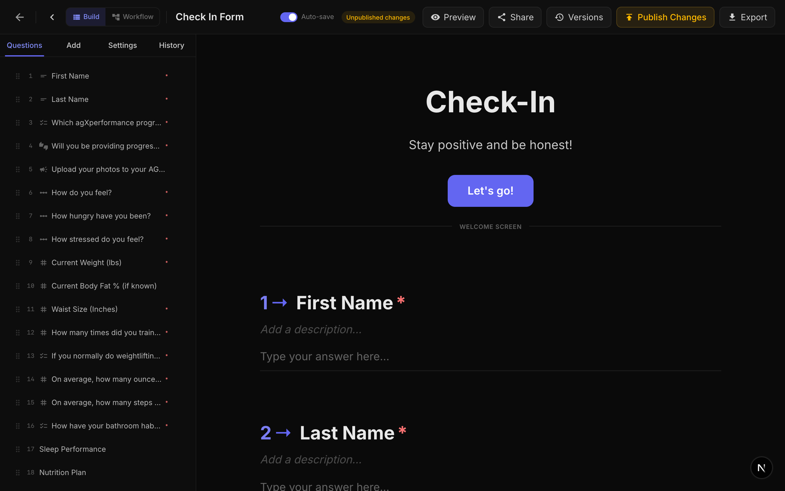
Welcome Screen
The welcome screen is the first thing respondents see when they open your form. Configure it with:
| Field | Description | Default |
|---|---|---|
| Welcome Title | The heading displayed on the welcome screen. Leave empty to skip the welcome screen entirely. | Empty (no welcome screen) |
| Welcome Description | Supporting text below the title. Supports rich text formatting. | Empty |
| Welcome Button Text | The label for the button that starts the form. | "Start" |
If you leave the Welcome Title empty, respondents will jump directly to the first question. This is useful for embedded forms or quick surveys.
Thank-You Screen
The thank-you screen appears after a respondent submits the form.
| Field | Description | Default |
|---|---|---|
| Thank You Title | The heading displayed after submission. | "Thank you!" |
| Thank You Description | Supporting text below the title. Supports rich text formatting and variable substitution. | Empty |
You can use {variableName} syntax in the thank-you description to display personalized content based on the respondent's answers. See the Variables guide for details.
Form Modes
NueForm supports four distinct form modes, each designed for a different purpose. The mode is set at the form level and affects how answers are scored and how end screens behave.
Standard Mode
The default mode for surveys, contact forms, feedback collection, and any form that does not require scoring.
- No scoring or grading.
- Responses are collected and displayed as-is.
- End screens are purely display-based.
Knowledge Quiz Mode
Designed for quizzes, tests, and assessments where there are correct and incorrect answers.
- Each scorable question (multiple choice, dropdown, picture choice, yes/no, legal, opinion scale, rating) can have correct answers defined.
- A correct answer score (default: 1 point) is awarded for each correct response.
- Quiz feedback can be shown after each question with customizable messages.
- The final score, number of correct answers, and total scorable questions are calculated and stored.
Quiz Settings:
| Setting | Description | Default |
|---|---|---|
| Show Correct Answers | Displays immediate feedback after each question telling the respondent if they were correct or incorrect. | Enabled |
| Correct Feedback Text | Custom message shown when the respondent answers correctly. Max 100 characters. | "Correct!" |
| Incorrect Feedback Text | Custom message shown when the respondent answers incorrectly. Max 100 characters. | "Incorrect!" |
Scoring Configuration (per question):
- Correct Answers (
correctAnswers): An array of choice IDs that constitute the correct answer. For single-answer questions, this contains one ID. For multi-select questions, all correct IDs must be selected. - Correct Answer Score (
correctAnswerScore): Points awarded for a correct answer. Defaults to 1.
Lead Qualification Mode
Designed for lead scoring, personality assessments, and forms where different answers carry different point values.
- Each choice in a scorable question is assigned a point value (
choiceScores). - Points accumulate as the respondent progresses.
- Multiple end screens can be configured with score ranges, and the respondent is routed to the appropriate end screen based on their total score.
Scoring Configuration (per question):
- Choice Scores (
choiceScores): A mapping of choice ID to point value. For example:{ "choice_1": 10, "choice_2": 5, "choice_3": 0 }.
End Screen Configuration:
- Each
end_screenquestion can have ascoreRangeproperty withminandmaxvalues. - After submission, the system matches the total score to the appropriate end screen.
Match Quiz Mode
Designed for personality quizzes, "Which character are you?" style forms, and outcome-based assessments.
- Each choice maps to one or more end screen outcomes (
choiceOutcomes). - As the respondent answers, tallies accumulate for each outcome.
- The end screen with the highest tally is displayed.
Scoring Configuration (per question):
- Choice Outcomes (
choiceOutcomes): A mapping of choice ID to an array of end screen question IDs. For example:{ "choice_1": ["end_screen_a", "end_screen_b"], "choice_2": ["end_screen_c"] }.
In all quiz modes, only scorable question types participate in scoring: Multiple Choice, Dropdown, Picture Choice, Yes/No, Legal, Opinion Scale, and Rating.
End Screen Questions
In quiz modes (knowledge, lead qualification, match), you can add multiple end_screen questions to your form. These act as conditional endings:
- Knowledge Quiz: The end screen is selected based on the respondent's score.
- Lead Qualification: Each end screen has a
scoreRange(min/max), and the matching range determines which screen is shown. - Match Quiz: Each end screen accumulates tallies from choice outcomes, and the one with the highest tally wins.
End screen questions are placed in the question list but are not shown during the form flow. They only appear at the end, replacing the default thank-you screen.
Adding Questions
Questions are added from the Question Type Palette on the left side of the form builder. Questions are organized into categories:
- Text: Short Text, Long Text, Email, Phone, Number, Website
- Choice: Multiple Choice, Dropdown, Picture Choice, Yes/No
- Rating: Rating, Opinion Scale, Net Promoter Score
- Date: Date
- Media: File Upload, Drawing, Video/Audio Recording, Signature
- Layout: Statement, Welcome Screen, End Screen, Summary, Save Answers, Question Group, Multi-Question Page, Markdown
- Advanced: Legal/Terms, Ranking, Matrix, Payment, Contact Info, Address
See the Question Types section for detailed documentation on each type.
Question Properties
Every question shares a set of common properties:
| Property | Description |
|---|---|
| Title | The question text displayed to the respondent. Supports rich text (bold, italic, underline, links) and {variable} substitution. |
| Description | Optional helper text shown below the title. Supports rich text and variable substitution. |
| Required | Whether the respondent must answer this question before proceeding. |
| Hidden | Whether the question is hidden from the respondent (useful for internal logic). |
| Custom Class Name | An optional CSS class name applied to the question container for custom styling. |
| Hide Question Number | Removes the question number prefix (e.g., "1 ->") from the display. |
| Transition | The animation used when transitioning to this question. Options: Vertical Slide (default), Horizontal Slide, Diagonal Slide, Elastic Bounce, Zoom Through, Rotate In. |
| Answer Variable | Stores the respondent's answer as a named variable for use in {variable} substitution in later questions. |
Media Attachments
Every question supports optional media attachments. You can add images, videos, icons, or QR codes to any question.
Media Types:
| Type | Description |
|---|---|
| Image | Upload an image or provide an external URL. Supports brightness, contrast, saturation, hue rotation, and blur adjustments. |
| Video | Embed a YouTube or Vimeo video with optional autoplay, muted, loop, and controls settings. |
| Icon | Choose from thousands of react-icons with customizable color. |
| QR Code | Generate a QR code from a URL template that supports {variable} substitution. |
Layout Options (Desktop):
| Layout | Description |
|---|---|
stack | Media appears above the question content (default). |
split-left | Media on the left, question on the right, in a side-by-side layout. |
split-right | Media on the right, question on the left. |
float-left | Media floats to the left of the question text. |
float-right | Media floats to the right of the question text. |
background | Media appears as a background behind the question. |
fullscreen-fit | Media fills the screen while maintaining aspect ratio. |
fullscreen-cover | Media covers the entire screen, cropping as needed. |
Layout Options (Mobile):
| Layout | Description |
|---|---|
stack | Media appears above the question (default). |
hidden | Media is hidden on mobile devices. |
background | Media appears as a background. |
fullscreen-fit | Media fills the screen while maintaining aspect ratio. |
fullscreen-cover | Media covers the entire screen. |
Image Adjustments:
| Adjustment | Range | Default |
|---|---|---|
| Brightness | -100 to 100 | 0 |
| Contrast | 0 to 200 | 100 |
| Saturation | 0 to 200 | 100 |
| Hue Rotate | 0 to 360 degrees | 0 |
| Blur | 0 to 20 px | 0 |
Focal Point: Set a focal point (0-1 normalized coordinates) to control which part of the image stays visible when cropped.
Slideshows
You can attach multiple media items to a single question to create a slideshow. Slideshow settings include:
| Setting | Description | Default |
|---|---|---|
| Duration | Seconds per slide. | 5 |
| Transition | Animation between slides: crossfade, slide, zoom, flip, ken-burns, blur-fade. | crossfade |
| Autoplay | Automatically advance slides. | Enabled |
| Show Indicators | Display dot indicators below the slideshow. | Enabled |
| Show Arrows | Display previous/next arrows. | Disabled |
| Pause on Hover | Pause autoplay when the user hovers over the slideshow. | Enabled |
Question Ordering
Questions are displayed to respondents in the order they appear in the builder. You can reorder questions by dragging them in the question navigator panel on the left side of the builder.
Saving and Publishing
Forms are saved automatically as you make changes. To make a form available to respondents, you must publish it. See the Publishing guide for details on the publishing workflow.