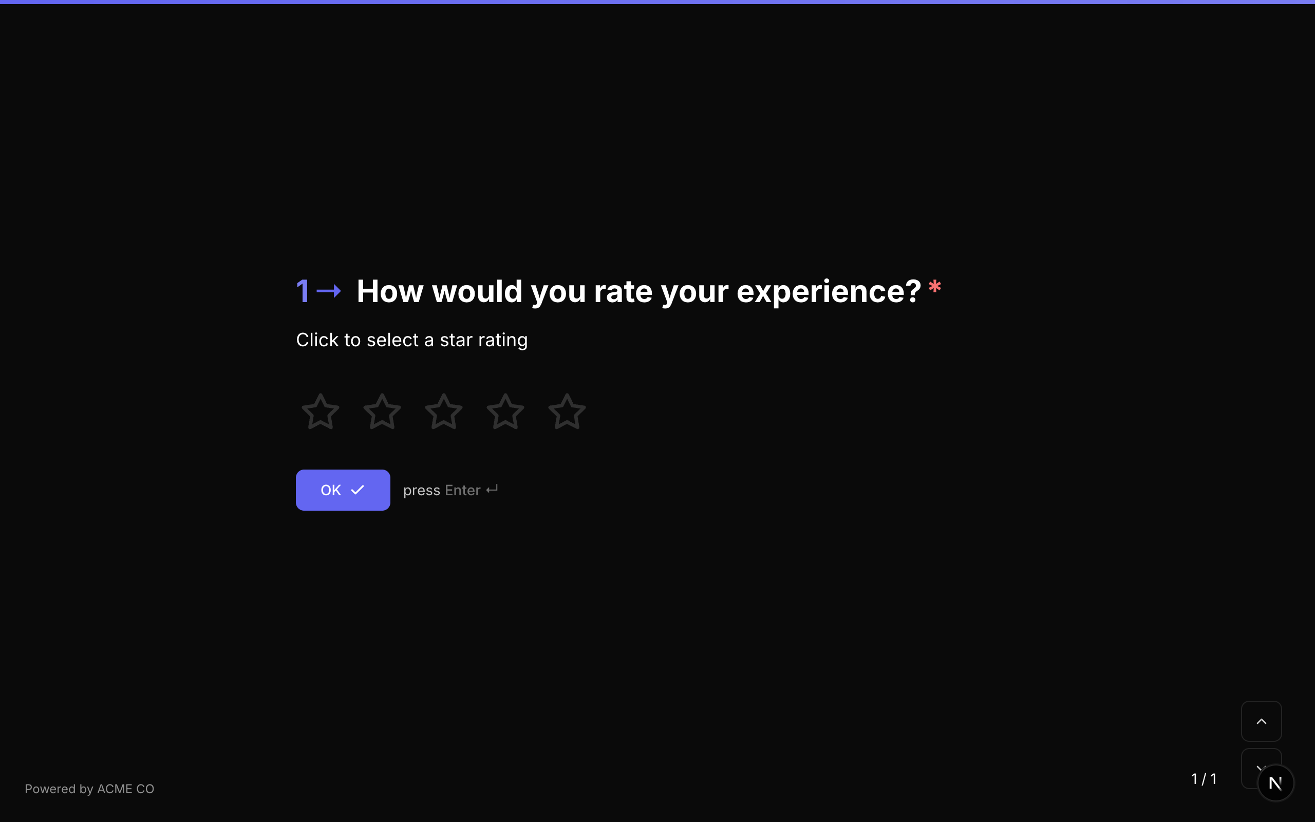
Rating
Collect feedback using clickable shape icons on a scale from 1 to N. The respondent clicks or taps a shape to set their rating.
Type identifier: rating
Properties
| Property | Type | Description | Default |
|---|---|---|---|
steps | number | The number of rating shapes to display (also settable via max). | 5 |
max | number | Alternative to steps -- the maximum rating value. steps takes precedence if both are set. | 5 |
shape | string | The shape of the rating icons. Options: star, heart, thumb, crown, lightning. | star |
Shape Options
| Shape | Icon | Description |
|---|---|---|
star | Star | Classic 5-star rating. |
heart | Heart | Heart-shaped icons for preference/love ratings. |
thumb | Thumbs Up | Thumbs-up icons for approval ratings. |
crown | Crown | Crown icons for premium/royalty ratings. |
lightning | Lightning Bolt | Lightning bolt icons for energy/excitement ratings. |
Interaction
- The respondent clicks or taps a shape to select a rating.
- Hovering over a shape previews the selection (all shapes up to and including the hovered one are highlighted).
- Clicking a shape auto-advances to the next question.
Validation
If required is true, the respondent must select a rating.
Logic Jump Operators
equals, not_equals, greater_than, less_than, greater_than_or_equals, less_than_or_equals, is_answered, is_not_answered
Answer Format
The answer is stored as a number (the selected rating value, 1 to N) or null if unanswered.
Quiz Mode Scoring
Rating is a scorable question type:
- Knowledge Quiz: Set
correctAnswerswith the expected rating value as a string (e.g.,["4"]). - Lead Qualification: Set
choiceScoreswith rating values as keys (e.g.,{ "1": 0, "2": 5, "3": 10, "4": 15, "5": 20 }). - Match Quiz: Set
choiceOutcomesmapping rating values to end screen IDs.
The rating shapes are fully styled through the theme system. You can customize their appearance using the .fc-rating-icon CSS selector.
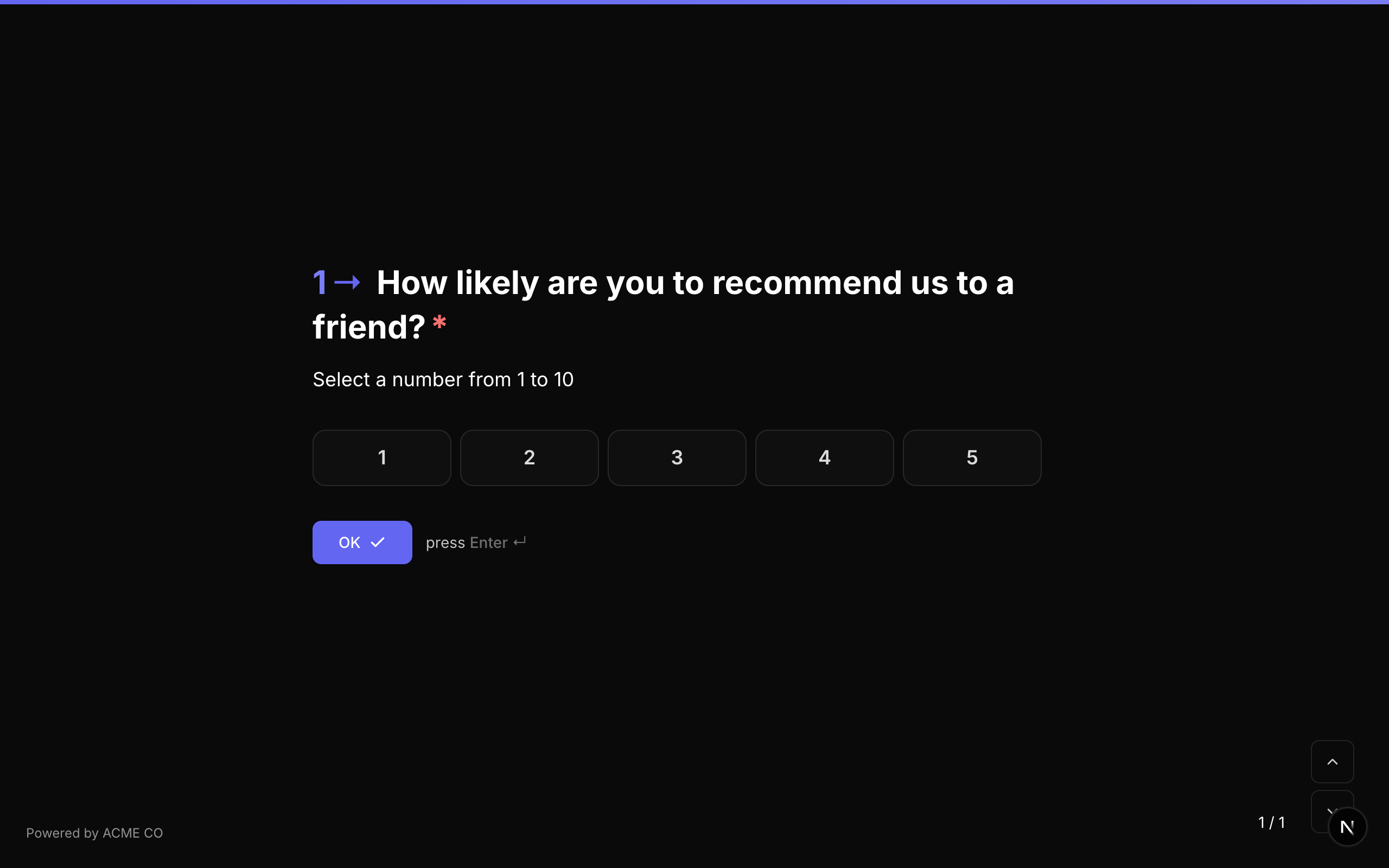
Opinion Scale
A numeric scale where respondents select a value within a configurable range. Optional labels at the left, center, and right positions help convey the meaning of each end of the scale.
Type identifier: opinion_scale
Properties
| Property | Type | Description | Default |
|---|---|---|---|
min | number | The minimum value on the scale. | 1 |
max | number | The maximum value on the scale. | 5 |
labels | object | Optional labels displayed at the edges and center of the scale. | None |
labels.left | string | Label for the minimum end of the scale (e.g., "Not at all likely"). | None |
labels.center | string | Label for the center of the scale (e.g., "Neutral"). | None |
labels.right | string | Label for the maximum end of the scale (e.g., "Extremely likely"). | None |
Common Scale Ranges
| Range | Use Case |
|---|---|
| 1-5 | General satisfaction, agreement scales |
| 1-7 | Likert scale |
| 1-10 | Detailed feedback, likelihood assessments |
| 0-10 | NPS-style (though the dedicated NPS type is preferred for NPS) |
Interaction
- The scale displays as a row of numbered buttons.
- The respondent clicks a number to select their rating.
- The selected number is highlighted with the accent color.
Validation
If required is true, the respondent must select a value.
Logic Jump Operators
equals, not_equals, greater_than, less_than, greater_than_or_equals, less_than_or_equals, is_answered, is_not_answered
Answer Format
The answer is stored as a number (the selected scale value) or null if unanswered.
Quiz Mode Scoring
Opinion Scale is a scorable question type:
- Knowledge Quiz: Set
correctAnswerswith the expected value. - Lead Qualification: Set
choiceScoresmapping each scale value to points. - Match Quiz: Set
choiceOutcomesmapping scale values to end screen IDs.
The scale items can be styled with the .fc-scale-item CSS selector. Labels are positioned automatically based on the scale width.
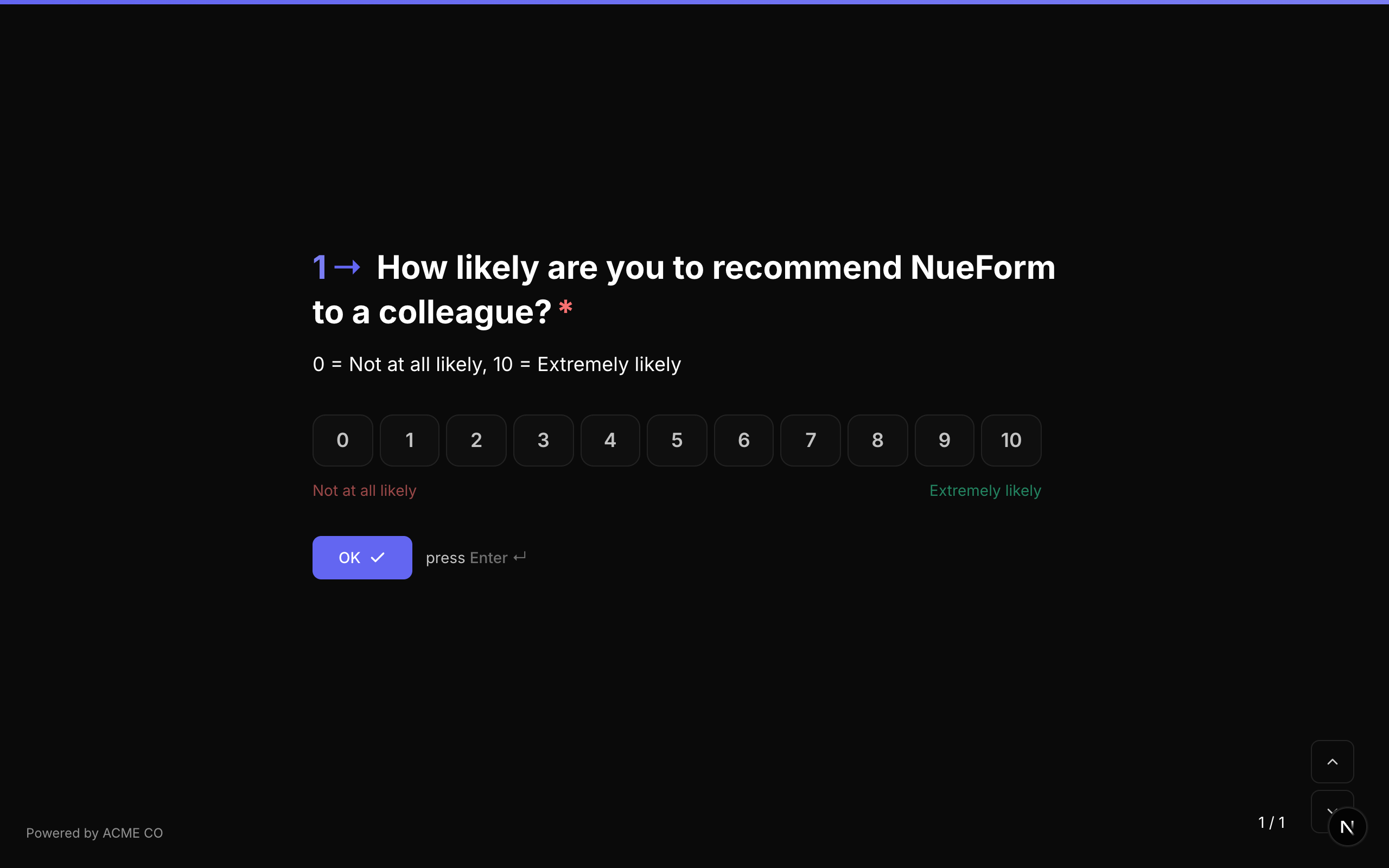
Net Promoter Score (NPS)
The standard Net Promoter Score question, always using a 0-10 scale. Used to measure customer loyalty and satisfaction.
Type identifier: nps
Properties
| Property | Type | Description | Default |
|---|---|---|---|
labels | object | Optional labels for the scale. | None |
labels.left | string | Label for the 0 end of the scale (e.g., "Not at all likely"). | None |
labels.center | string | Label for the center of the scale. | None |
labels.right | string | Label for the 10 end of the scale (e.g., "Extremely likely"). | None |
Fixed Scale
The NPS question type always uses a 0-10 scale. The min and max values are fixed and cannot be changed. This aligns with the standard NPS methodology.
NPS Score Categories
NPS responses are categorized as follows:
| Score | Category | Description |
|---|---|---|
| 0-6 | Detractors | Unhappy customers who may discourage others. |
| 7-8 | Passives | Satisfied but unenthusiastic customers. |
| 9-10 | Promoters | Loyal enthusiasts who will refer others. |
The NPS score for your form is calculated as: % Promoters - % Detractors.
Interaction
- Displays as a row of 11 numbered buttons (0 through 10).
- The respondent clicks a number to select their score.
- The selected number is highlighted.
Validation
If required is true, the respondent must select a score.
Logic Jump Operators
equals, not_equals, greater_than, less_than, greater_than_or_equals, less_than_or_equals, is_answered, is_not_answered
Answer Format
The answer is stored as a number (0-10) or null if unanswered.
NPS items can be styled with the .fc-scale-item CSS selector, the same as opinion scale items.