
Multiple Choice
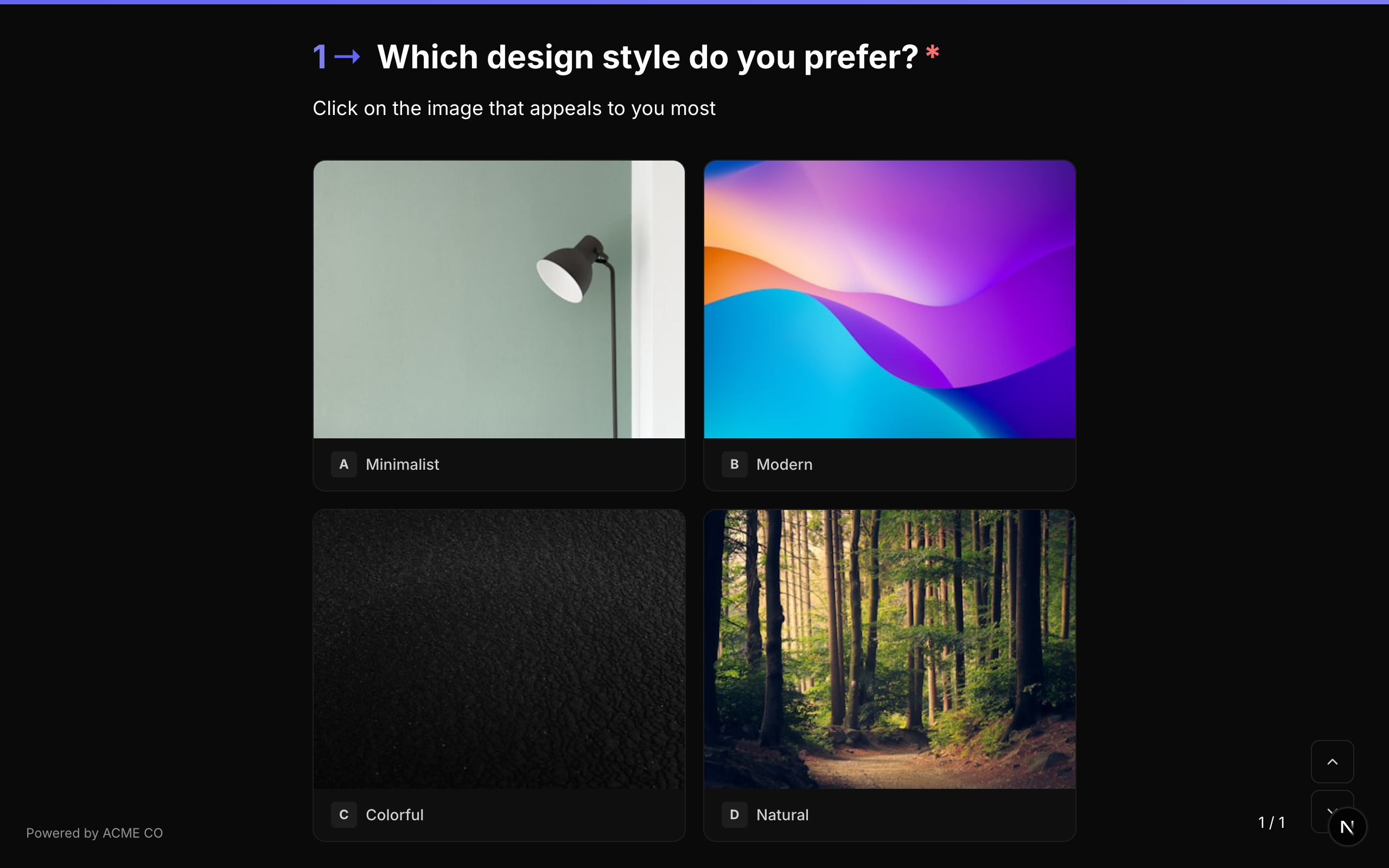
Présentez une liste d'options parmi lesquelles le répondant peut choisir. Prend en charge la sélection unique, la sélection multiple, le champ libre « Autre », l'ordre aléatoire et le tri alphabétique. Chaque choix peut porter sa propre image, vidéo ou icône, et la propriété layout permet de basculer entre une liste verticale et une grille de cartes illustrées — ce seul type couvre donc aussi bien les options en texte simple que celles basées sur des images.
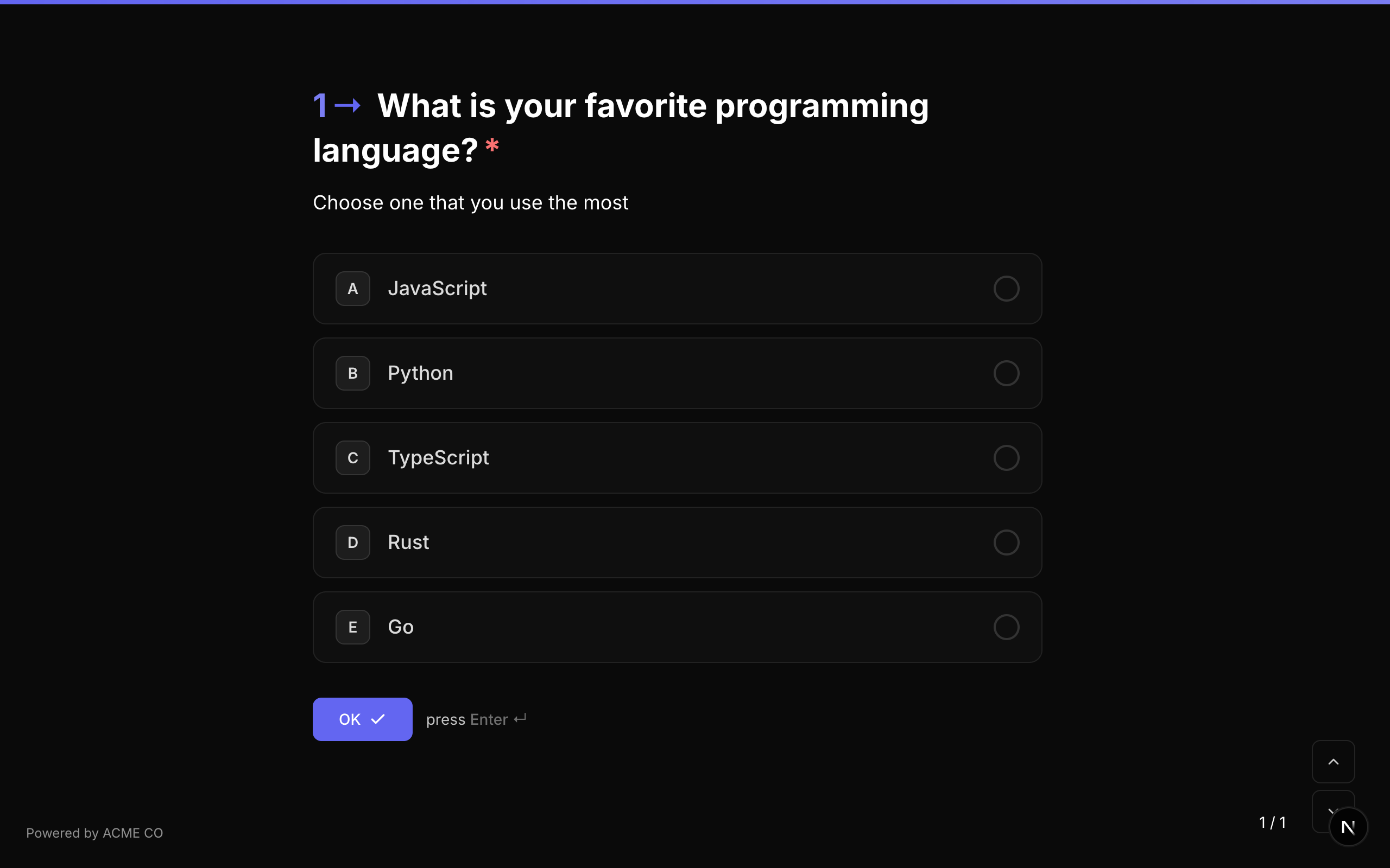
Type identifier: multiple_choice
Properties
| Property | Type | Description | Default |
|---|---|---|---|
choices | Choice[] | Tableau des options de choix. Chaque choix possède un id, un label et un media facultatif. | [] |
layout | string | Mode de présentation des choix : stacked (liste verticale, vignettes facultatives), blocks (grille de cartes illustrées), staggered (pastilles dimensionnées au contenu qui passent à la ligne) ou grid (grille à colonnes fixes). | stacked |
allowMultiple | boolean | Allow the respondent to select more than one option. | false |
allowOther | boolean | Show an "Other" option with a free-text input where the respondent can type a custom answer. | false |
randomize | boolean | Randomize the order of choices each time the question is displayed. | false |
alphabeticalOrder | boolean | Sort choices alphabetically. Ignored if randomize is enabled (randomize takes precedence). | false |
choiceSource | string | Origine des choix : fixed utilise choices ; variable les charge depuis une variable. Voir Choix depuis une variable. | fixed |
Choice Object
Each choice in the choices array has:
| Field | Type | Description |
|---|---|---|
id | string | Unique identifier for this choice. Used in logic jumps and scoring. |
label | string | The display text for the choice. |
media | QuestionMedia | Image, vidéo ou icône facultative pour ce choix. Définissez media.display pour contrôler son rendu — voir ci-dessous. |
Médias des choix
Tout choix peut porter son propre média. media.display détermine la façon dont il s'intègre au choix :
| Affichage | Description |
|---|---|
thumbnail | Une petite image à côté de l'étiquette du choix. |
background | L'image remplit la surface du choix, recadrée pour la couvrir entièrement. |
background-fit | L'image remplit la surface du choix mais reste entière, avec des bandes sur la couleur de fond du choix. |
Les médias des choix prennent en charge les mêmes traitements que les médias de question — filtres, teinte, bordures, point focal et zoom. Voir Affichage des médias des choix pour comprendre la différence entre Remplir et Ajuster et savoir quand utiliser l'un ou l'autre.
Les médias des choix sont ce qu'est devenu l'ancien type de question Picture Choice. Pour créer une grille de cartes illustrées, utilisez Multiple Choice avec layout: "blocks" et donnez à chaque choix un objet media. Les formulaires importés depuis Typeform convertissent automatiquement les questions picture_choice vers cette forme.
Validation
If required is true, the respondent must select at least one option before proceeding.
Logic Jump Operators
equals, not_equals, is_answered, is_not_answered
When using equals or not_equals, the comparison value is the choice ID. For multi-select questions, equals checks if the value is among the selected items.
Answer Format
- Single select (
allowMultiple: false): A string (the selected choice ID). - Multi-select (
allowMultiple: true): An array of strings (the selected choice IDs).
Quiz Mode Scoring
Multiple Choice is a scorable question type in all quiz modes:
- Knowledge Quiz: Set
correctAnswers(array of correct choice IDs) andcorrectAnswerScore(points per correct answer). - Lead Qualification: Set
choiceScores(mapping of choice ID to point value). - Match Quiz: Set
choiceOutcomes(mapping of choice ID to end screen question IDs).
Keyboard shortcuts are available for choice selection. Respondents can press letter keys (A, B, C, etc.) to select options, which appear as indicators next to each choice.
Dropdown
Un menu déroulant permettant de sélectionner une option dans une liste. Prend en charge la même configuration que Multiple Choice, mais affiche les options dans un format déroulant compact. Les media par choix et la propriété layout ne s'appliquent pas ici — une liste déroulante affiche toujours ses options en texte brut.
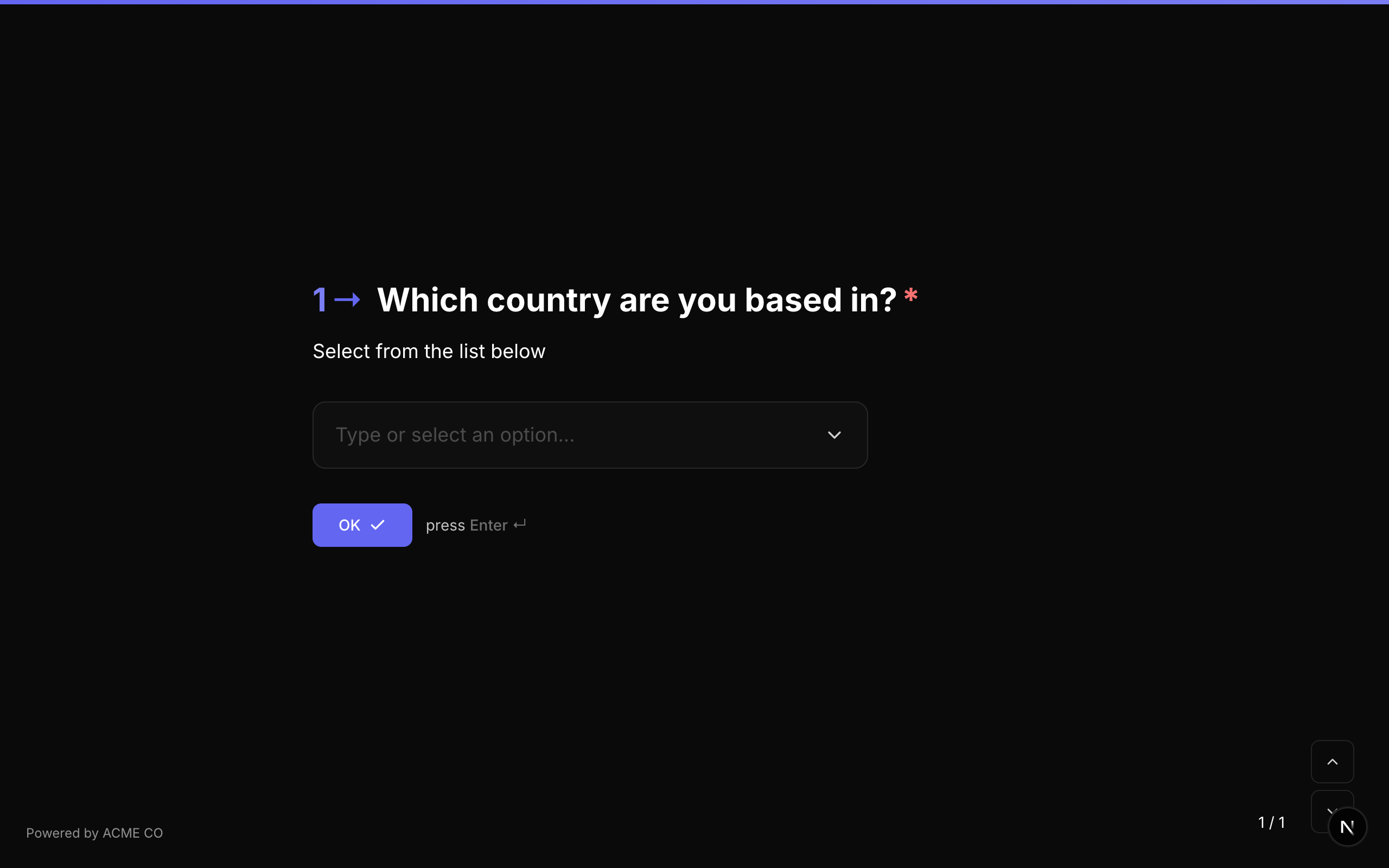
Type identifier: dropdown
Properties
| Property | Type | Description | Default |
|---|---|---|---|
choices | Choice[] | Array of choice options. | [] |
allowMultiple | boolean | Allow selecting multiple options from the dropdown. | false |
allowOther | boolean | Show an "Other" option with free-text input. | false |
placeholder | string | Placeholder text shown before a selection is made. | None |
randomize | boolean | Randomize the order of choices. | false |
alphabeticalOrder | boolean | Sort choices alphabetically. | false |
choiceSource | string | Origine des choix : fixed utilise choices ; variable les charge depuis une variable. Voir Choix depuis une variable. | fixed |
Validation
If required is true, the respondent must select at least one option.
Logic Jump Operators
equals, not_equals, is_answered, is_not_answered
Answer Format
- Single select: A string (the selected choice ID).
- Multi-select: An array of strings (the selected choice IDs).
Quiz Mode Scoring
Dropdown is a scorable question type. Scoring configuration is identical to Multiple Choice.
Picture Choice
Picture Choice n'est plus un type de question distinct. Il a été fusionné avec Multiple Choice — il n'existe plus d'identifiant picture_choice à sélectionner.
Pour obtenir le même résultat, utilisez une question Multiple Choice avec layout défini sur blocks et un objet media sur chaque choix. Tout ce que faisait Picture Choice reste disponible, avec en plus les traitements dont il n'a jamais disposé : choix en vidéo et en icône, filtres, teinte, point focal, zoom, et un mode Ajuster qui affiche les images larges en entier au lieu de les recadrer.
{
  "type": "multiple_choice",
  "properties": {
    "layout": "blocks",
    "choices": [
      { "id": "c1", "label": "Mountains", "media": { "type": "image", "url": "https://…", "display": "background" } },
      { "id": "c2", "label": "Coast", "media": { "type": "image", "url": "https://…", "display": "background" } }
    ]
  }
}
Les formulaires existants et les imports Typeform sont pris en charge pour vous — une question picture_choice est convertie automatiquement en Multiple Choice avec layout: "blocks", sans rien avoir à réécrire.
Yes / No
A simple binary question that presents "Yes" and "No" buttons.
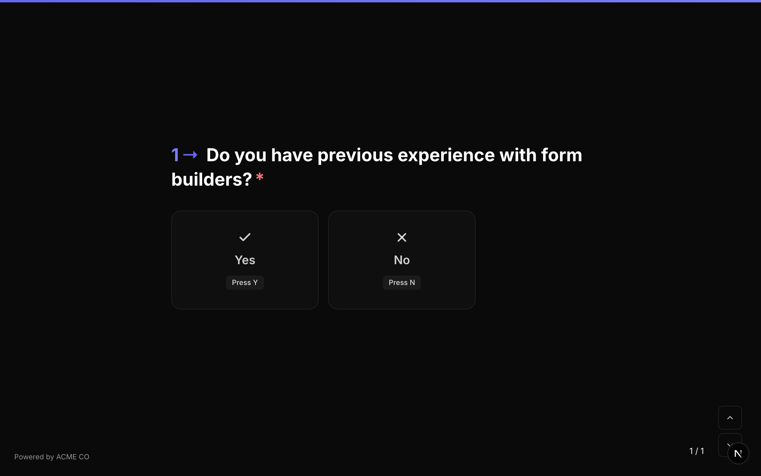
Type identifier: yes_no
Properties
The Yes/No question type has no additional properties beyond the common question properties.
Validation
If required is true, the respondent must click either "Yes" or "No".
Logic Jump Operators
equals, not_equals, is_answered, is_not_answered
When using equals, compare against true (Yes) or false (No). String values "true" and "false" are also accepted.
Answer Format
The answer is stored as a boolean (true for Yes, false for No, or null if unanswered).
Quiz Mode Scoring
Yes/No is a scorable question type:
- Knowledge Quiz: Set
correctAnswerswith a single value of"true"or"false". - Lead Qualification: Set
choiceScoreswith keys"true"and"false". - Match Quiz: Set
choiceOutcomeswith keys"true"and"false".
The Yes/No question auto-advances to the next question immediately upon selection. There is no separate "OK" button.
Ranking
Present a list of items for the respondent to arrange in their preferred order by dragging and dropping.
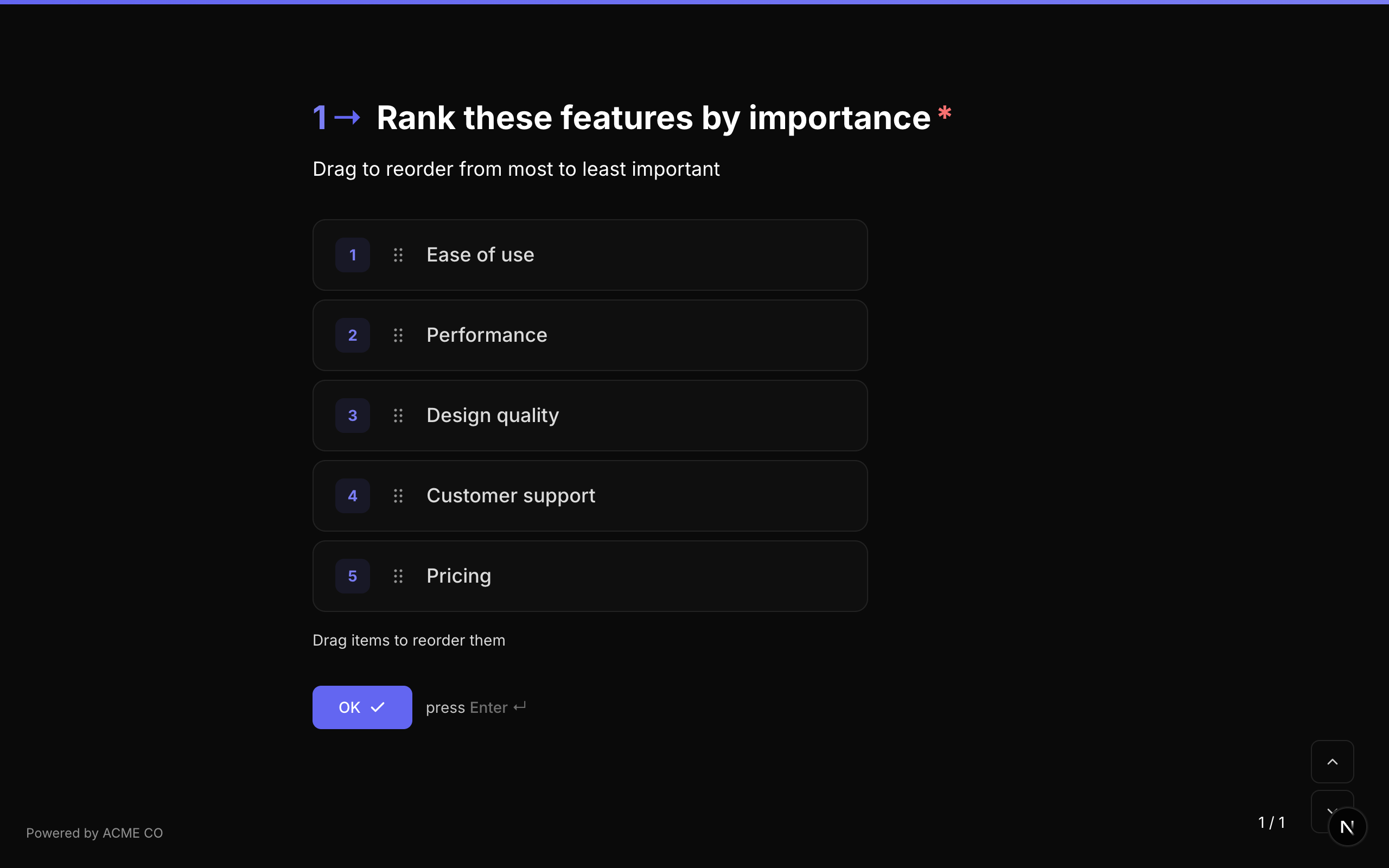
Type identifier: ranking
Properties
| Property | Type | Description | Default |
|---|---|---|---|
choices | Choice[] | Array of items to rank. Each has an id and label. | [] |
choiceSource | string | Origine des éléments : fixed utilise choices ; variable les charge depuis une variable. Voir Choix depuis une variable. | fixed |
Validation
If required is true, the respondent must submit a ranking (all items must be in a defined order).
Logic Jump Operators
equals, not_equals, is_answered, is_not_answered
Answer Format
The answer is stored as an array of strings (choice IDs in the respondent's ranked order, from first to last).
["choice_3", "choice_1", "choice_2"]
The ranking field uses drag-and-drop interaction. On mobile devices, respondents can use touch gestures to reorder items.
Matrix
A grid-based question type where respondents rate multiple items (rows) across multiple categories (columns). Each row-column intersection is a selectable option.
Type identifier: matrix
Properties
| Property | Type | Description | Default |
|---|---|---|---|
rows | string[] | Array of row labels (the items being rated). | [] |
columns | string[] | Array of column labels (the rating categories). | [] |
randomizeRows | boolean | Randomize the order of rows. | false |
randomizeColumns | boolean | Randomize the order of columns. | false |
rowSource | string | Origine des lignes : fixed utilise rows ; variable les charge depuis une variable. Voir Choix depuis une variable. | fixed |
columnSource | string | Origine des colonnes : fixed utilise columns ; variable les charge depuis une variable. | fixed |
Validation
If required is true, the respondent must select one option per row.
Logic Jump Operators
equals, not_equals, is_answered, is_not_answered
Answer Format
The answer is stored as an object (Record<string, string>) mapping each row label to the selected column label:
{
  "Product Quality": "Excellent",
  "Customer Service": "Good",
  "Value for Money": "Average"
}
Matrix questions display as a responsive grid on desktop and adapt to a stacked format on mobile devices for better usability. Both rows and columns support independent randomization.
List
Collectez plusieurs entrées de même nature. Une Liste contient soit de simples éléments texte (saisissez et appuyez sur Entrée, ou touchez Ajouter), soit des éléments composites répétés — des entrées structurées construites à partir d'un composite réutilisable, comme l'ajout d'un nombre quelconque de membres de conseil à une seule question.
Type identifier: list
Properties
| Property | Type | Description | Default |
|---|---|---|---|
itemType | string | string pour de simples éléments texte, composite pour des instances de composite répétables. | string |
compositeId | string | Le composite référencé (éléments composites uniquement). Défini via le sélecteur. | — |
itemPlaceholder | string | Texte indicatif pour le champ de saisie de l'entrée (éléments texte). | — |
addButtonLabel | string | Étiquette personnalisée du bouton Ajouter dans les deux modes d'élément. | — |
minItems | number | Nombre minimum d'éléments requis pour envoyer. | — |
maxItems | number | Nombre maximum d'éléments. Plafond strict de 100. | 100 |
itemRegex | string | Format de validation par élément (éléments texte). | — |
itemRegexError | string | Message d'erreur affiché lorsque le format échoue. | — |
itemMinLength | number | Nombre minimum de caractères par élément (éléments texte). | — |
itemMaxLength | number | Nombre maximum de caractères par élément (éléments texte). | — |
allowDuplicates | boolean | Autoriser l'ajout deux fois du même élément texte (éléments texte). | true |
allowReorder | boolean | Permettre aux répondants de glisser les éléments pour les réordonner (éléments texte). | true |
defaultItems | string[] | Éléments pré-remplis au premier chargement de la question (éléments texte, formulaires web). | [] |
displayMode | string | Façon dont une entrée composite repliée s'affiche : compact (résumé sur une ligne) ou card (étiquette + valeur de chaque champ). | compact |
compactFields | string[] | Identifiants de sous-champs, dans l'ordre, affichés dans le résumé compact replié. Par défaut, le premier champ du composite. | — |
Validation
Si required est vrai, au moins un élément doit être ajouté. minItems / maxItems sont vérifiés à l'envoi ; les règles de format et de longueur par élément (éléments texte) sont vérifiées au fur et à mesure de l'ajout de chaque élément.
Logic Jump Operators
list_count_equals, list_count_greater_than, list_count_less_than, contains, not_contains, is_answered, is_not_answered
Les opérateurs de comptage se comparent au nombre d'éléments dans la réponse.
Answer Format
- Éléments texte : un tableau de chaînes.
- Éléments composites : un tableau d'objets, chacun indexé par l'identifiant de sous-champ :
[
  { "sub_first_name": "Ada", "sub_email": "ada@example.com" },
  { "sub_first_name": "Grace", "sub_email": "grace@example.com" }
]
Chaque élément composite est aussi enregistré comme une entrée de composite autonome — voir le guide Composites pour la vue Entrées inter-formulaires et les modes d'affichage repliés.
Choix depuis une variable
Choix multiple, Menu déroulant et Classement peuvent charger leurs options depuis une variable au lieu d'une liste fixe — généralement la réponse d'un nœud de données qui appelle votre API. Une Matrice peut faire de même pour ses lignes, ses colonnes, ou les deux.
Configuration
- Ajoutez un nœud de données qui renvoie la liste et donnez-lui une Variable de réponse — par exemple
breeds. - Dans les réglages de la question, faites passer Source des choix de Liste fixe (le réglage par défaut) à Depuis une variable. Sur une Matrice, utilisez Source des lignes et Source des colonnes.
- Saisissez la variable qui contient la liste :
{breeds}, ou un chemin dans la réponse comme{breeds.data}. - Si vos éléments n'utilisent pas les clés
labeletvalue, ouvrez Vos éléments utilisent d'autres noms de champ ? et indiquez le Champ du libellé et le Champ de la valeur qu'utilisent vos données.
Dans un formulaire de style NueForm, placez le nœud de données avant la question. Dans un formulaire de style Questionnaire, réglez Quand exécuter du nœud de données sur Garder à jour pour que la liste suive les réponses du répondant — voir Style Questionnaire.
Ces réglages de source ne sont proposés que pour les questions placées directement dans le formulaire. L'éditeur ne les affiche pas pour une question située dans un Groupe de questions, une Page multi-questions ou un composite, car ces questions enregistrent leur réponse à l'intérieur de celle de l'élément parent, où les libellés ne peuvent pas être conservés. Une question qui charge déjà ses options depuis une variable garde ce réglage si vous la déplacez dans l'un d'eux, mais ses réponses affichent alors les valeurs des éléments au lieu des libellés.
Sur le canevas de l'éditeur, la question affiche Options de {breeds} à la place de ses options.
Formats acceptés
La variable doit contenir une liste JSON — soit de simples chaînes, où chaque chaîne est à la fois le libellé et la valeur :
["Siamese", "Persian"]
soit d'objets avec un libellé et une valeur :
[
  { "label": "Siamese", "value": "siamese" },
  { "label": "Persian", "value": "persian" }
]
Les objets qui utilisent d'autres clés fonctionnent aussi — indiquez ces clés avec Champ du libellé et Champ de la valeur. Pour cette réponse, utilisez la variable {breeds.data}, le Champ du libellé name et le Champ de la valeur id :
{ "data": [{ "name": "Siamese", "id": "siamese" }, { "name": "Persian", "id": "persian" }] }
Sur Choix multiple, un élément peut aussi porter une URL image, qui devient l'image de cette option :
[{ "label": "Siamese", "value": "siamese", "image": "https://example.com/siamese.jpg" }]
Lorsque la réponse est un objet, pointez vers la liste qu'il contient avec un chemin à points comme {breeds.data}. Pour une clé qui n'est pas un simple mot, utilisez {breeds["the list"]}.
Lecture des éléments
- La valeur de chaque élément devient son identifiant de choix. C'est ce que stocke la réponse, ce que comparent les conditions logiques et ce que vérifie la notation des quiz.
- Si un objet n'a qu'un libellé ou qu'une valeur, celui-ci sert pour les deux. Les nombres et
true/falsesont lus comme du texte. - Les éléments sans valeur, ou ayant la même valeur qu'un élément précédent, sont ignorés, tout comme les valeurs de plus de 500 caractères. Les libellés de plus de 500 caractères sont raccourcis, et seuls les 1 000 premiers éléments sont utilisés.
- Les libellés s'affichent en texte brut : aucune mise en forme n'est appliquée et les jetons
{variable}qu'ils contiennent ne sont pas remplacés. - « Autre » fonctionne toujours sur Choix multiple et Menu déroulant : il apparaît après les éléments chargés.
- Les autres réglages de la question — comme Autoriser les sélections multiples, Ordre aléatoire et Ordre alphabétique — s'appliquent aux éléments chargés comme d'habitude.
- Un nœud de données conserve jusqu'à 4 096 caractères de sa réponse ; une longue liste peut donc arriver tronquée. Voir Utiliser la réponse d'un nœud de données comme liste de choix.
Ce que voient les répondants
Il n'y a pas de liste fixe de secours. Tant que la variable ne contient pas de liste exploitable, la question affiche l'un des trois premiers messages ci-dessous à la place des options. Le dernier s'affiche au-dessus des options après un changement de la liste :
| Message | Quand |
|---|---|
| Chargement des options… | Le nœud de données qui remplit la liste est en cours d'exécution. |
| Les options apparaîtront une fois que vous aurez répondu aux questions ci-dessus. | La variable est encore vide — généralement parce que le nœud de données attend une réponse. |
| Impossible de charger ces options. | La variable ne contient pas de liste exploitable. L'aperçu de l'éditeur indique aussi pourquoi. |
| Mis à jour selon votre réponse précédente. | La liste a changé et une option que le répondant avait sélectionnée n'est plus proposée : elle a donc été effacée. |
Réponses enregistrées
- La réponse stocke les valeurs des éléments, exactement comme des identifiants de choix. Sur une Matrice, elle associe la valeur de chaque ligne à la valeur de la colonne choisie.
- Les libellés que le répondant a vus sont enregistrés avec la réponse : les réponses, les exports CSV et les e-mails de notification affichent donc des libellés plutôt que des valeurs.
- Les webhooks envoient les valeurs avec une table
valueLabelsqui associe chaque valeur choisie à son libellé, pour les soumissions sur le web comme pour celles faites par appel téléphonique. - La liste est chargée pendant que le répondant remplit le formulaire, donc NueForm ne revérifie pas les valeurs soumises par rapport à elle. Les questions obligatoires restent exigées. Si une réponse doit faire partie de vos propres éléments, vérifiez-la dans votre système lorsque vous traitez la réponse.
Notation et conditions
- Notation : il n'y a pas de liste fixe à cocher, donc l'éditeur de notation demande plutôt des valeurs d'éléments, qui doivent correspondre exactement (« Correspond exactement à la valeur de l'élément. »). Voir Modes de formulaire.
- Conditions : les sauts logiques et les conditions de visibilité sur ces questions utilisent des opérateurs de texte et une valeur saisie. Sur une Matrice, l'éditeur de conditions ne propose que
is_answeredetis_not_answered, car sa réponse associe des lignes à des colonnes. Voir Sauts logiques. - Appels téléphoniques : l'agent lit toutes les options de la liste, et l'appelant peut dire une option ou taper son numéro. Voir Téléphonie.
Propriétés de la source
| Propriété | Type | Description | Défaut |
|---|---|---|---|
choiceSource | string | fixed utilise choices. variable charge les options depuis choiceVariable, et choices est ignoré. | fixed |
choiceVariable | string | La variable qui contient la liste, comme {breeds} ou {breeds.data}. | — |
choiceLabelField | string | Pour des éléments objets : la clé qui contient le libellé de chaque élément. | label |
choiceValueField | string | Pour des éléments objets : la clé qui contient la valeur de chaque élément. | value |
Une Matrice dispose du même ensemble pour chaque axe : rowSource, rowVariable, rowLabelField, rowValueField et columnSource, columnVariable, columnLabelField, columnValueField.